Government Protocol Cover Design
Challenge
In April 2020 I found out about a design opportunity from a connection at the Sheriff’s Office in my small hometown. They had been working for a while on an official document detailing a protocol for Fire, Law, and EMS agencies responding to an emergency. The document itself was mostly complete but needed a polished cover design that would reflect its content and professional quality.
In return I would be paid by the Sheriff’s Office and receive a letter of recommendation.
- Target audience
- Fire, Law, and EMS/Ambulance agencies and their employees
- Federal, State, County, City, and Tribal Governments and representatives
- Brand description
- Polished
- Professional
- Inclusive
- Urgent
- Unique
- Client goals
- Communicate the concepts within the document
- Not prioritize any one agency/discipline over another
- Communicate the sense of urgency that lies behind responding to an incident
- Other guidelines
- Include branding of the originating and publishing agency (Sheriff’s Office)
- Avoid photographs because of legal/logistical reasons
Process
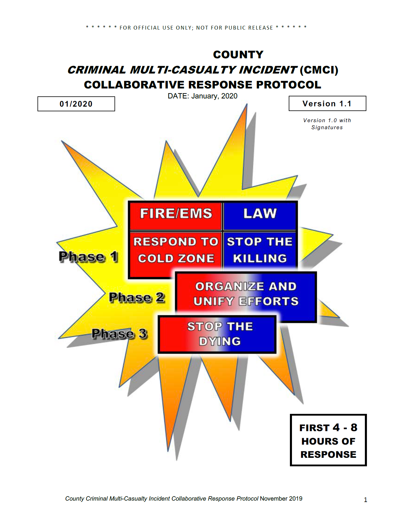
I started by looking at examples of government documents and emergency preparedness material. I took note of common design elements, such as a white or solid cool-hued background, use of rules and boxes, and general prioritizing of clarity over style.
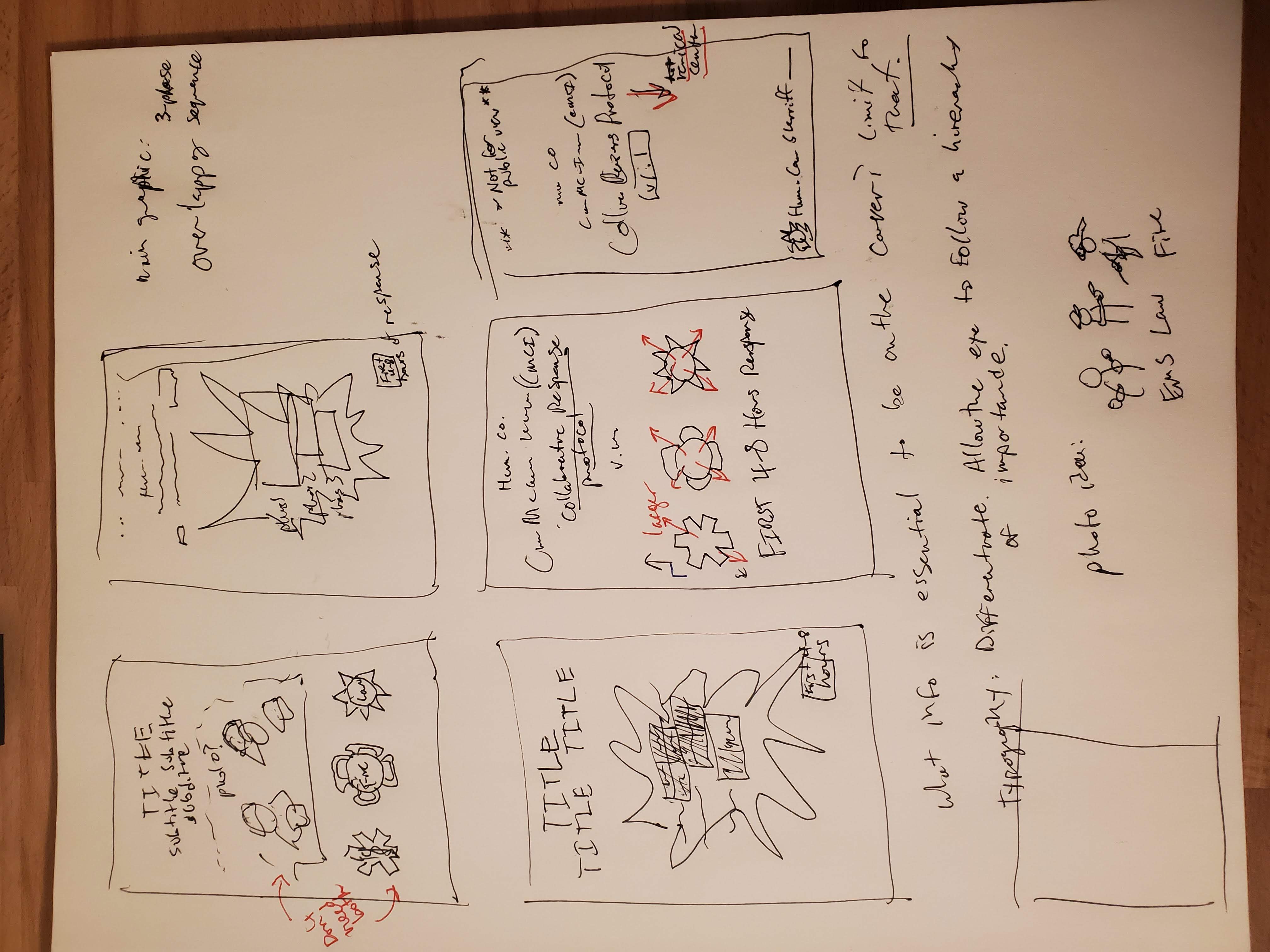
I sketched thumbnails to try different composition ideas.
Roughs
I utilized Photoshop’s new Artboard feature to make some mockups of general design sensibilities, and got feedback from the client.
I made note of common margins on basic office printers and took these margins into account in my designs, as the document would be physically printed to use in the field.
I used type size and style to create a hierarchy and included the dark green commonly used in the Sheriff’s Office branding. Instead of photos, I used generic symbols for each discipline (Fire, Law, and EMS) that were provided to me by the client.
Symbols
The biggest issue with the cover was communicating the concepts inside the document using generic symbols of the disciplines. I spent a while talking with the client and reading the protocol document to get a sense of the concepts.
I broke the problem into two parts:
- Creating generic symbols for each discipline
- Finding a graphic way to unify them that evokes the specified ideas
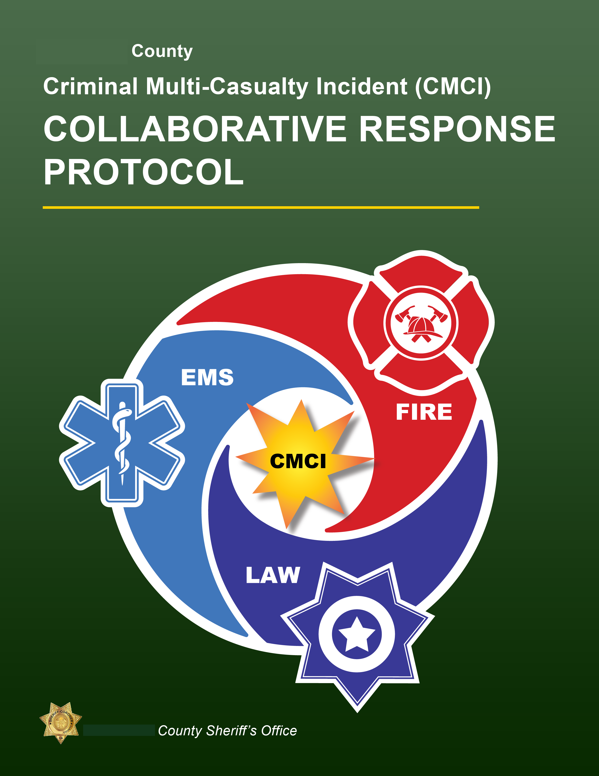
I looked at many different versions of the three symbols: the cross of life (EMS), the Maltese cross (Fire), and seven-point star (Law). I took note of common variations, associated colors and symbols, and started narrowing down what level of detail to include. I used the global color editor in Adobe Illustrator to streamline color adjustment.
Unification
I had to create an original graphic to unify the symbols. I looked at infographics, presentation design, flowcharts, and even religious icons. To communicate urgency and represent the incident I reused a graphic from the inside of the document: a yellow-orange starburst.
The client and I settled on a circular graphic with three parts spiraling inward towards the starburst. I made sure it didn’t too closely resemble similar designs from other contexts, such as spirituality or tech.
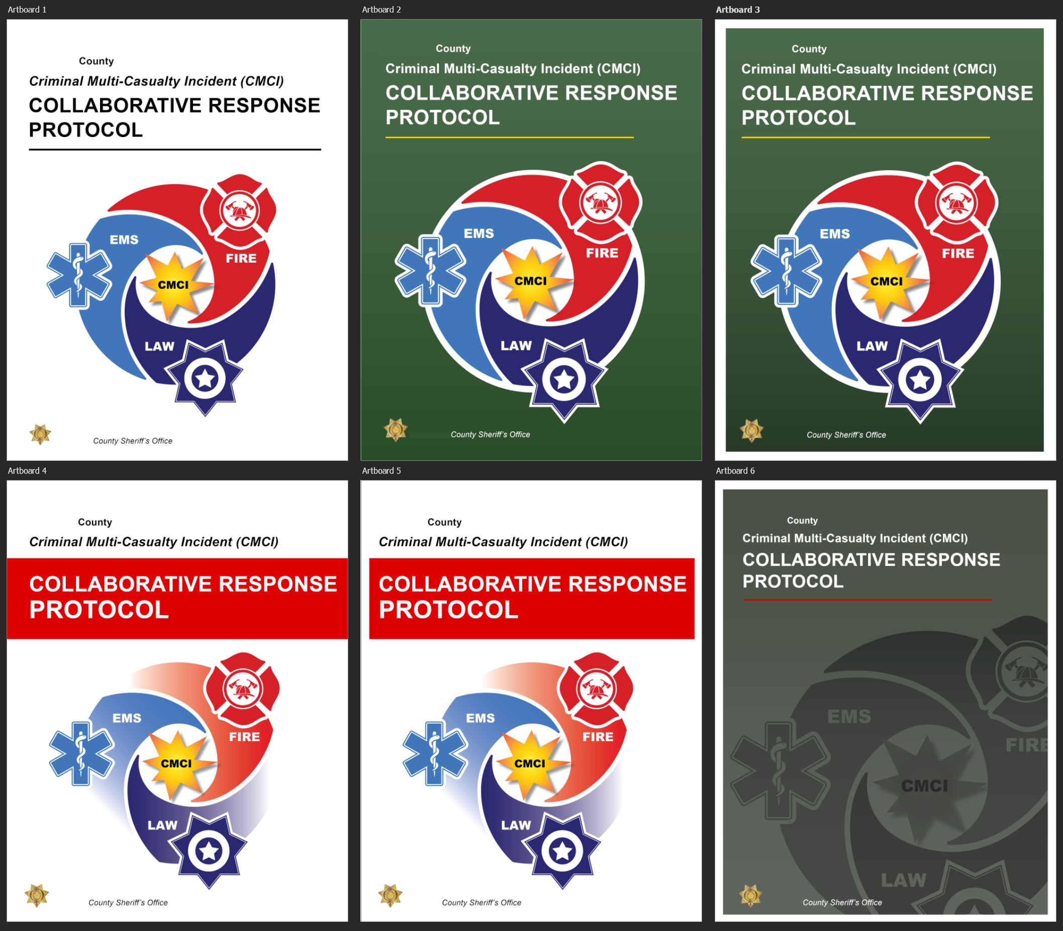
Final Deliverables
Here are the final six cover designs I gave the client to choose from, integrating the circular graphic with earlier page mockups. Two are slight variations meant to show the white printing margins.
The bottom right mockup is an option focused mainly on looking polished and stylish. I got a lot of positive feedback on this design, but ultimately the client chose the second design, citing the circle graphic’s utility in communication the core concepts.
Results
- Value
- Polished, professional cover that communicates quality
- Integrated client branding
- Visually communicates document’s key concepts
- Tools
- Adobe Illustrator
- Adobe Photoshop
- Adobe Stock
- Pen & Paper
- Adobe Acrobat DC
- Microsoft Surface Tablet
- Skills
- Compositon
- Typography
- Logo design
- Color Theory
- Commercial Printing
- Vector and Raster Image Processing
- Rapport with client
- Total hours
- 12.5