Personal Branding
As I'm beginning to apply to positions, I thought it would be good to have a personal brand and apply it to all related documents.
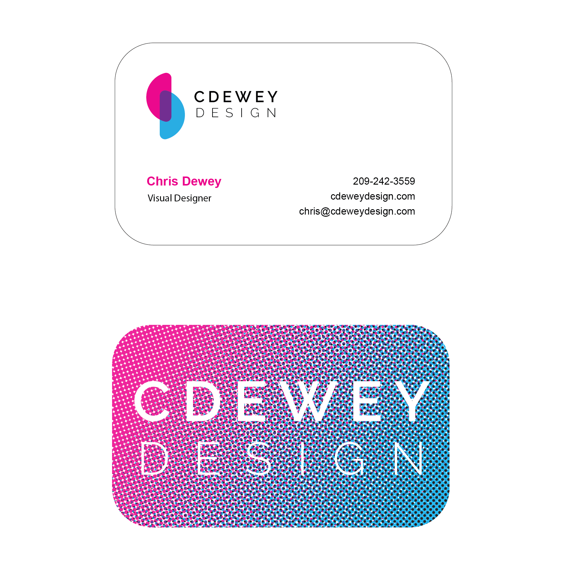
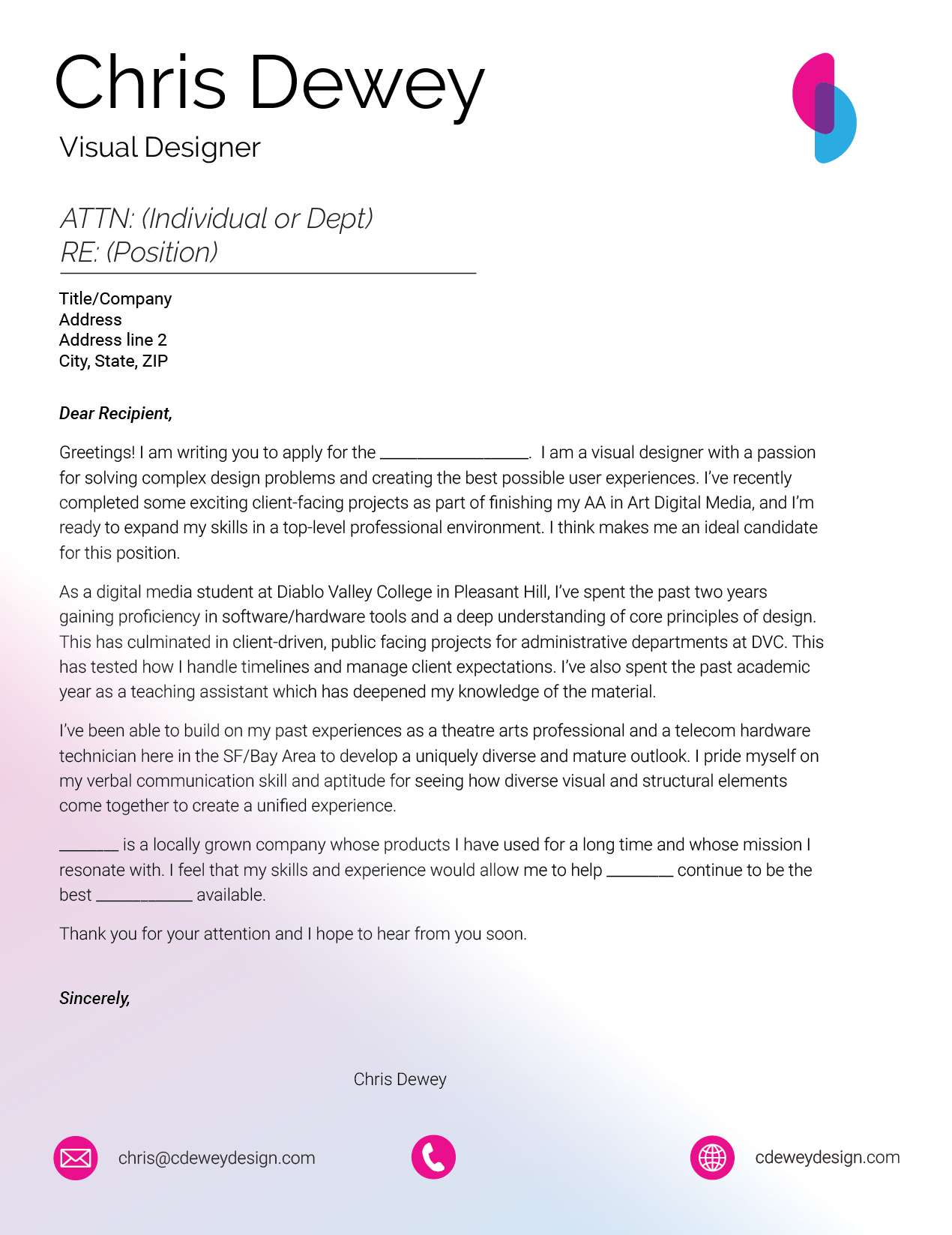
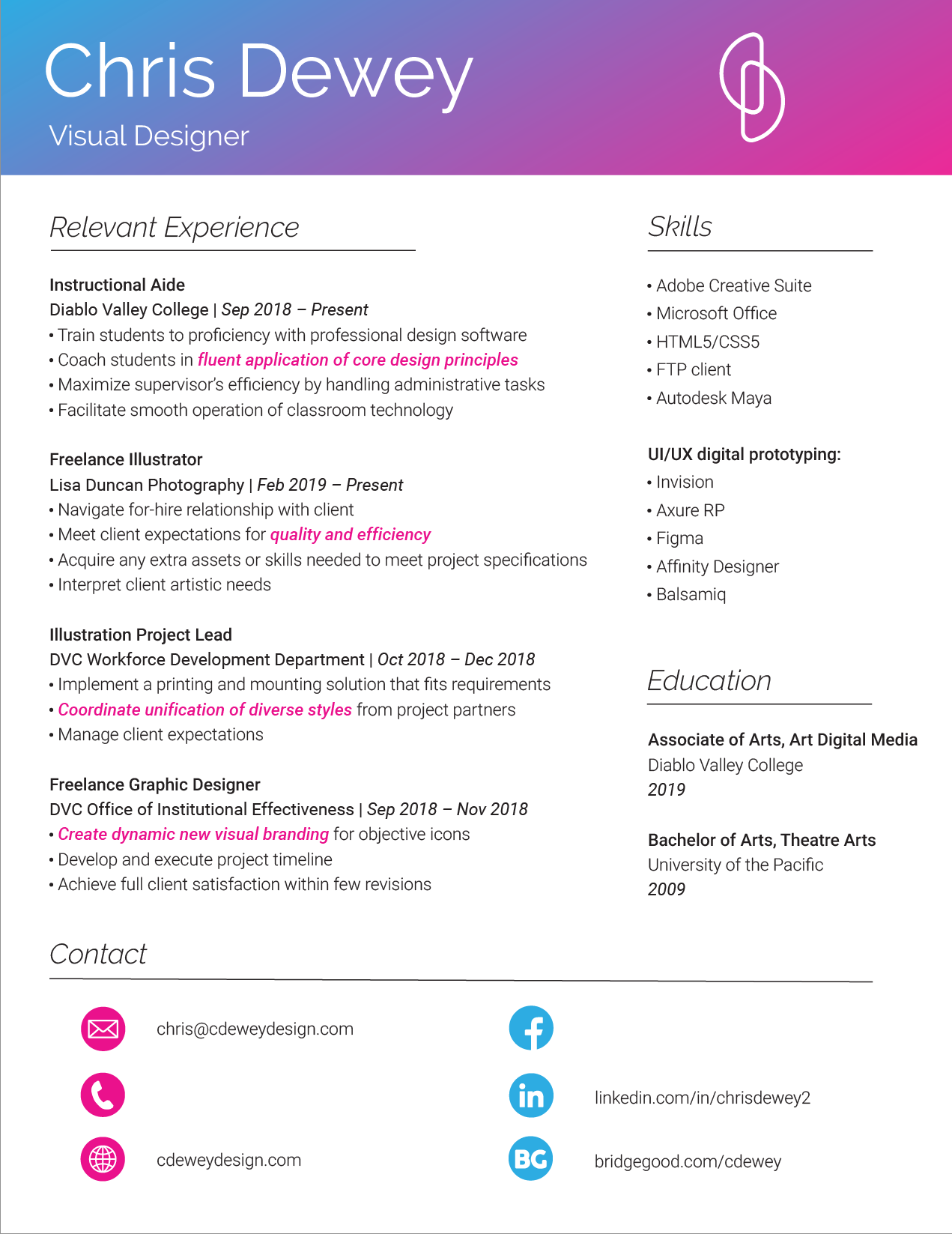
I started with creating a logo. This turned out to be possibly the most difficult design problem I've faced. Trying to encapsulate my brand, my style and personality, and make it unique, simple, clean, and strongly communicative, took many iterations. I think I filled five sketchbook pages with brainstorming and refining. I relied heavily on feedback from peers and mentors.
Ultimately I found that two rounded half-circles could represent my initials in an abstract way. I based the color choice on Cyan and Magenta, being one half of the CMYK color space that is so prevalent in graphic design.
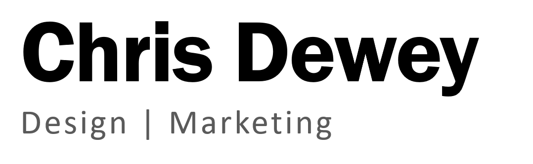
The typefaces are Raleway and Roboto, the former I chose for its modernity and the unique overlapping capital "W," the latter as a flexible sans-serif good for body copy that complements the angles of Raleway with a few more curves. Overall I think this visual brand does a good job of conveying the vitality, professionalism and creativity I bring to my design work.