Invasive Species Guide
Challenge
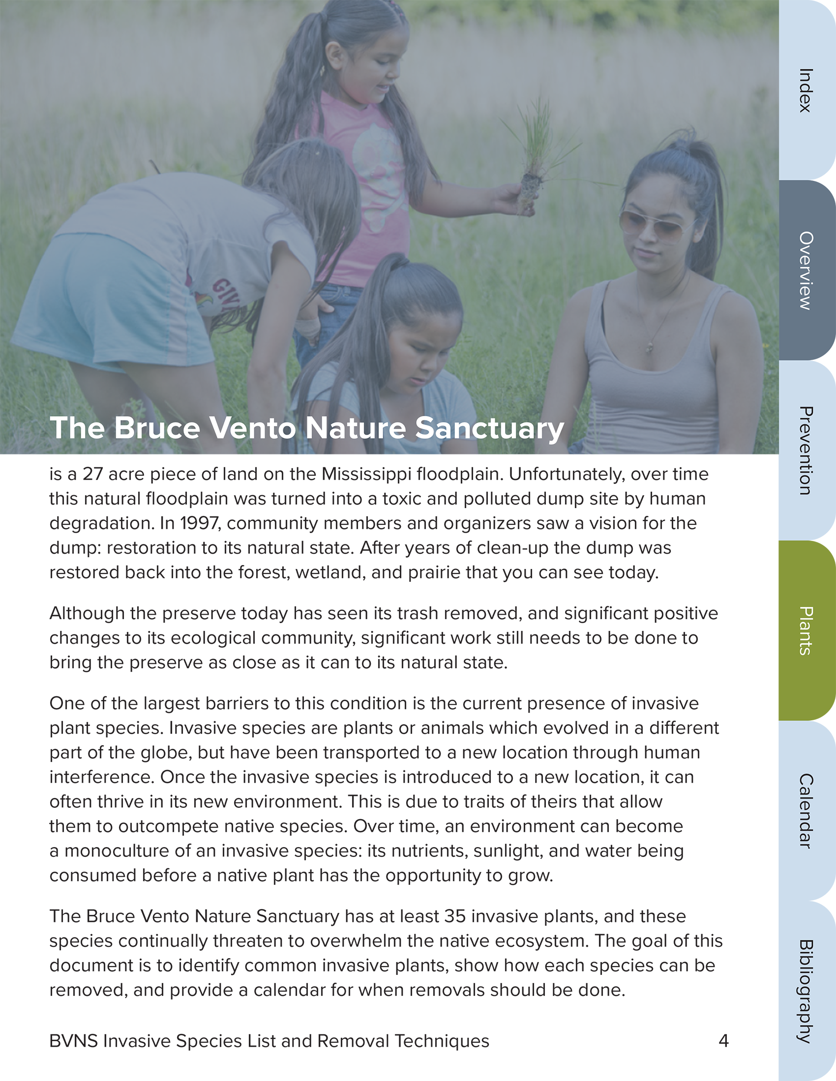
July of 2020 I joined the volunteering site Catchafire with the goal of building my experience and helping out some good causes with my design skills. I applied to a handful of jobs based on my interests, including community-focused non-profits, arts organizations, and environmental groups. I was very happy to hear back from the Lower Phalen Creek Project, an indigenous-led environmental non-profit in St. Paul, Minnesota. They offered me the job of redesigning and adding interactivity to a 100-page report on invasive species in their restoration area.

- Target audience
- Board members of organization
- Other employees of the organization
- Volunteers
- Interested community members
- Donors
- Brand description
- Polished
- Professional
- Natural
- Accessible
- Client goals for design
- Make the large document easily navigable
- Visual engaging
- Matches organization branding and visual style
- Other client guidelines
- Follow organization style and usage guidelines
- Document will be used by organization members and volunteers to identify these plants
Process
I started my research with the organization itself, learning about its history, programs, and goals. To make sure I wasn’t insensitive to any cultural concerns I learned as much as I could about the Dakota people, whose members lead the organization and whose values affect their policies and tactics.
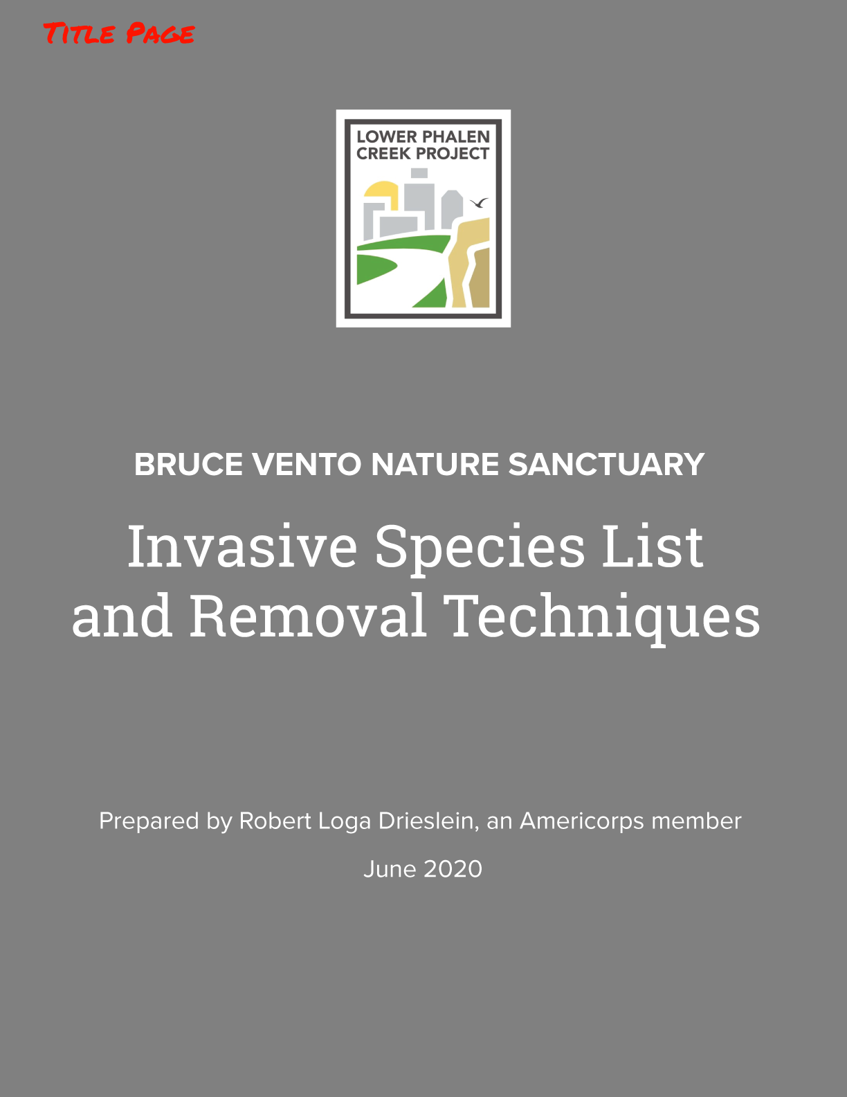
I was given a style guide to follow, which detailed font, color, photography and logo usage. I also had examples of other documents from the organization, as well as their website itself, to go off of. Finally, I used online resources to get a general idea of what other designers have done with documents of this type.
Sketches
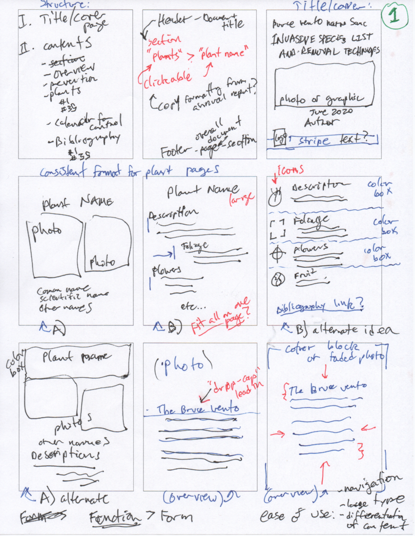
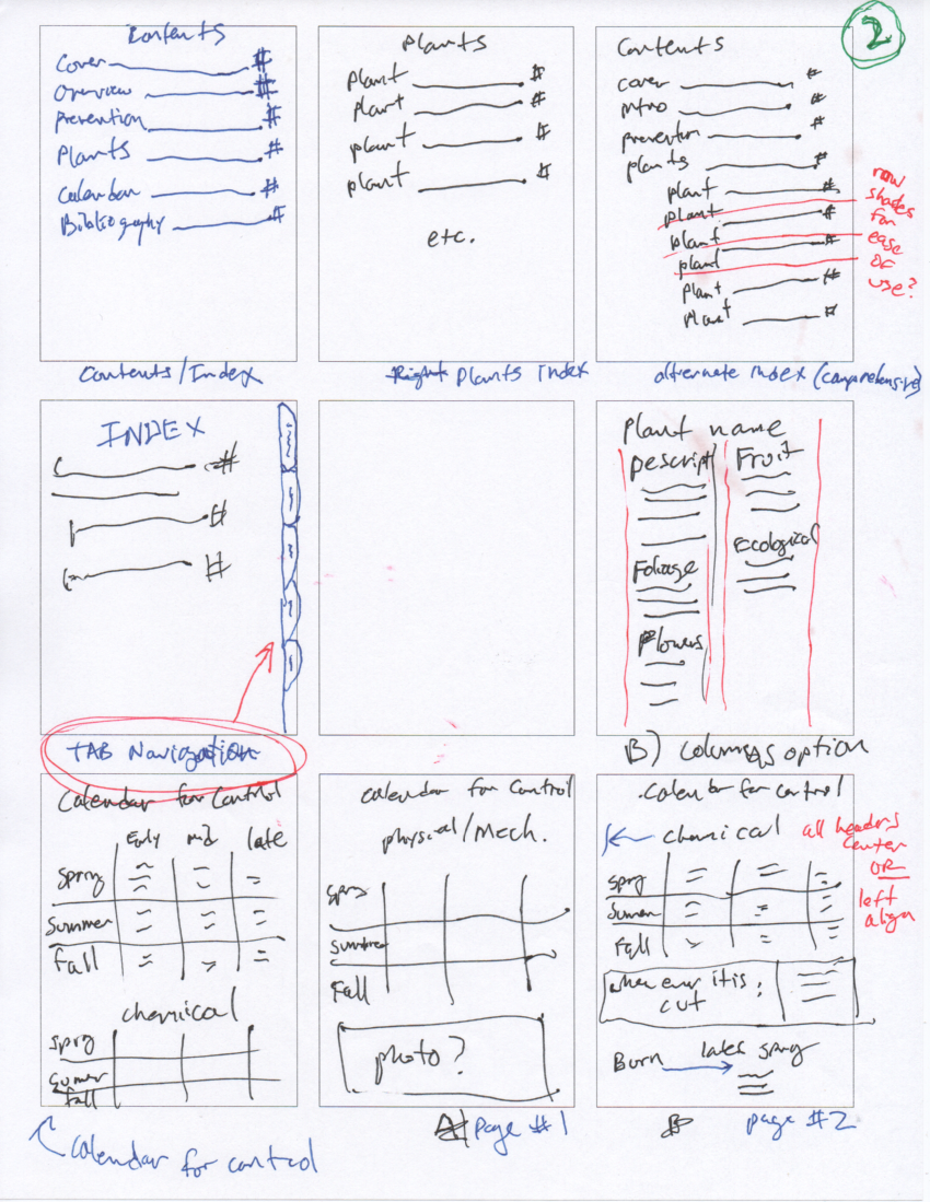
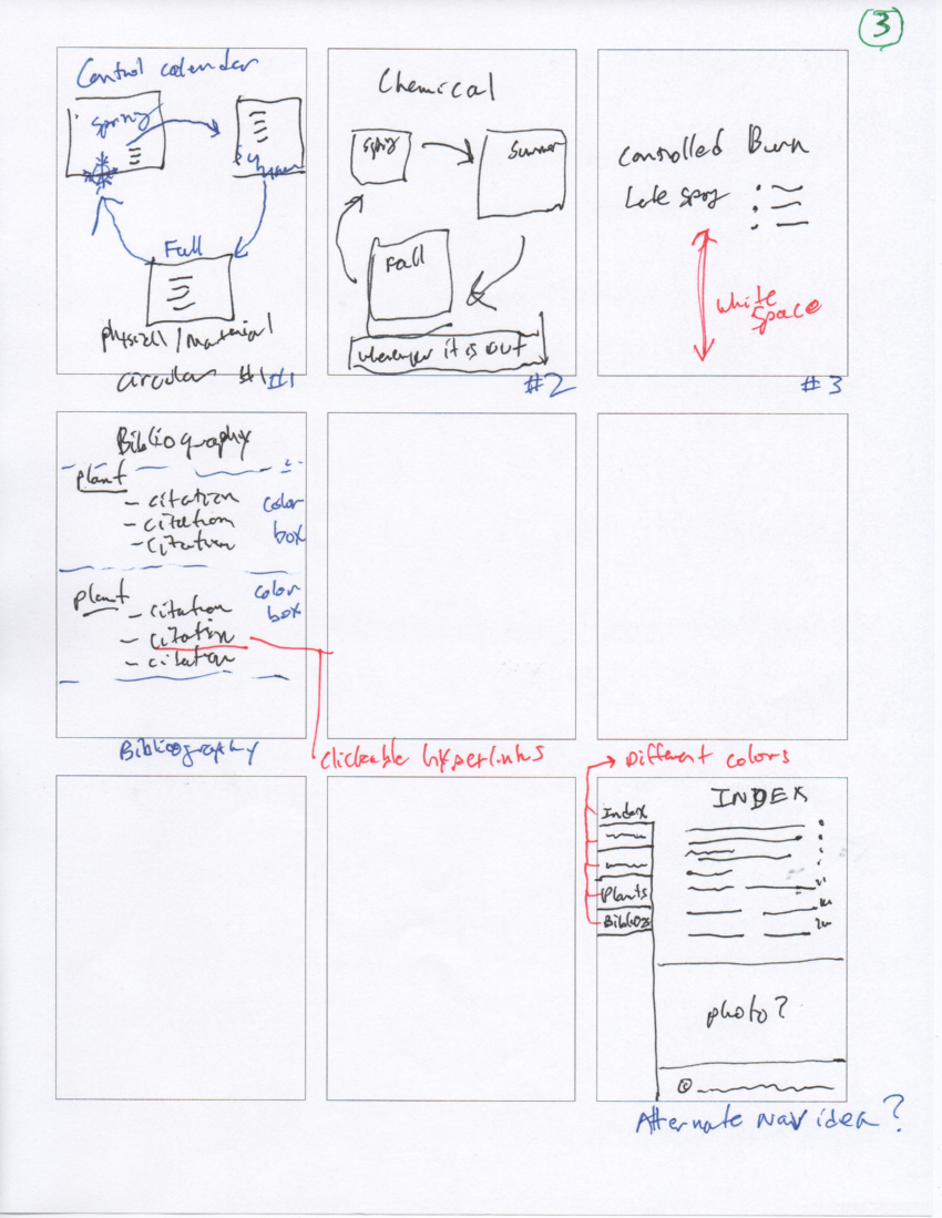
Looking at the raw document, I started making rough thumbnail ideas on paper, one or two ideas for each section: Cover, Index, Plant Info, Calendar, and Bibliography.
Although during brainstorming I sketched out some fancier ideas, the focus was on readability and usability, as per the client goals.
Digital Roughs
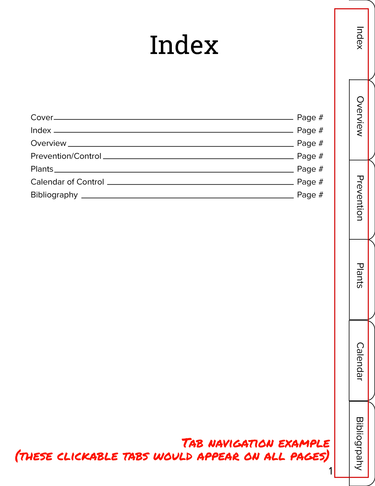
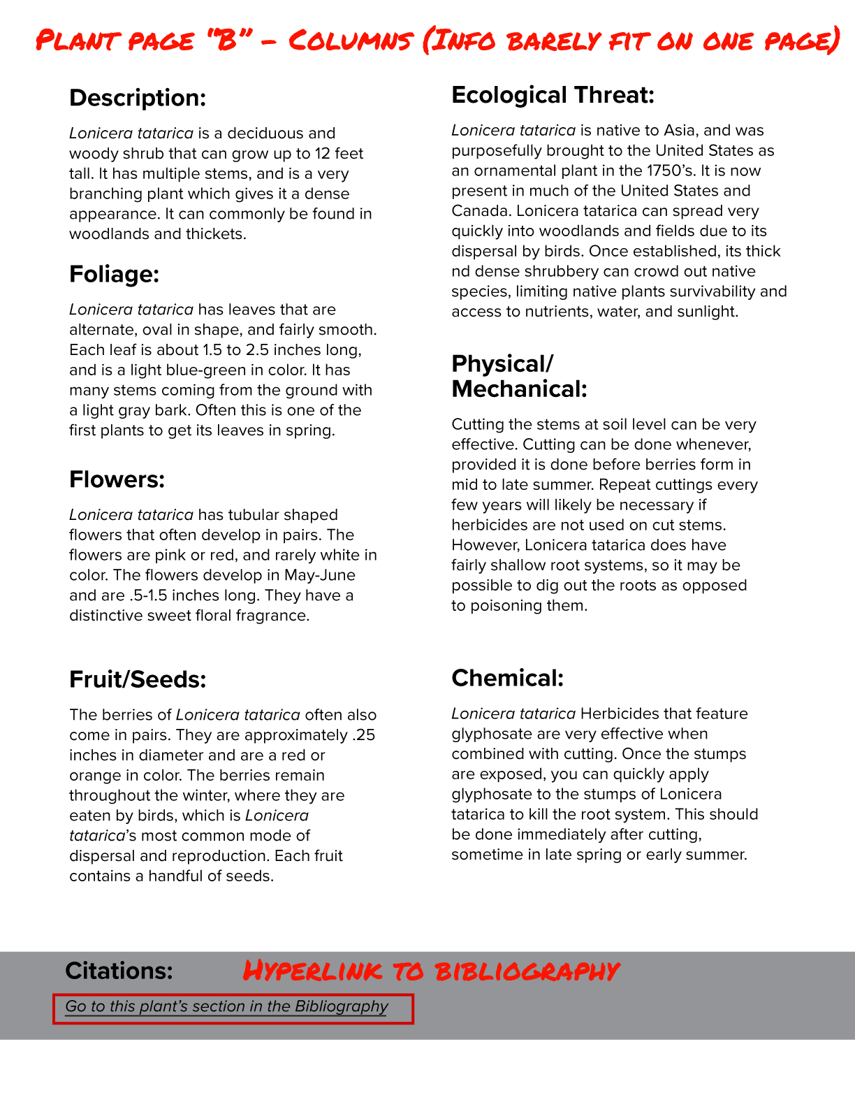
I made rough mockups without color in Adobe Illustrator, using the actual copy given to me so I could start working out spacing. Consistency and repetition are great assets in making a large document easy to use, so I tried to see if the main body of the document could follow a two-page format: one layout for photos and basic info, and a second page for detailed information. I tried to find the plant page with the most copy, and it was able to fit it in a two-column layout in 12 point font.
The client and I settled on a circular graphic with three parts spiraling inward towards the starburst. I made sure it didn’t too closely resemble similar designs from other contexts, such as spirituality or tech.
Information Design
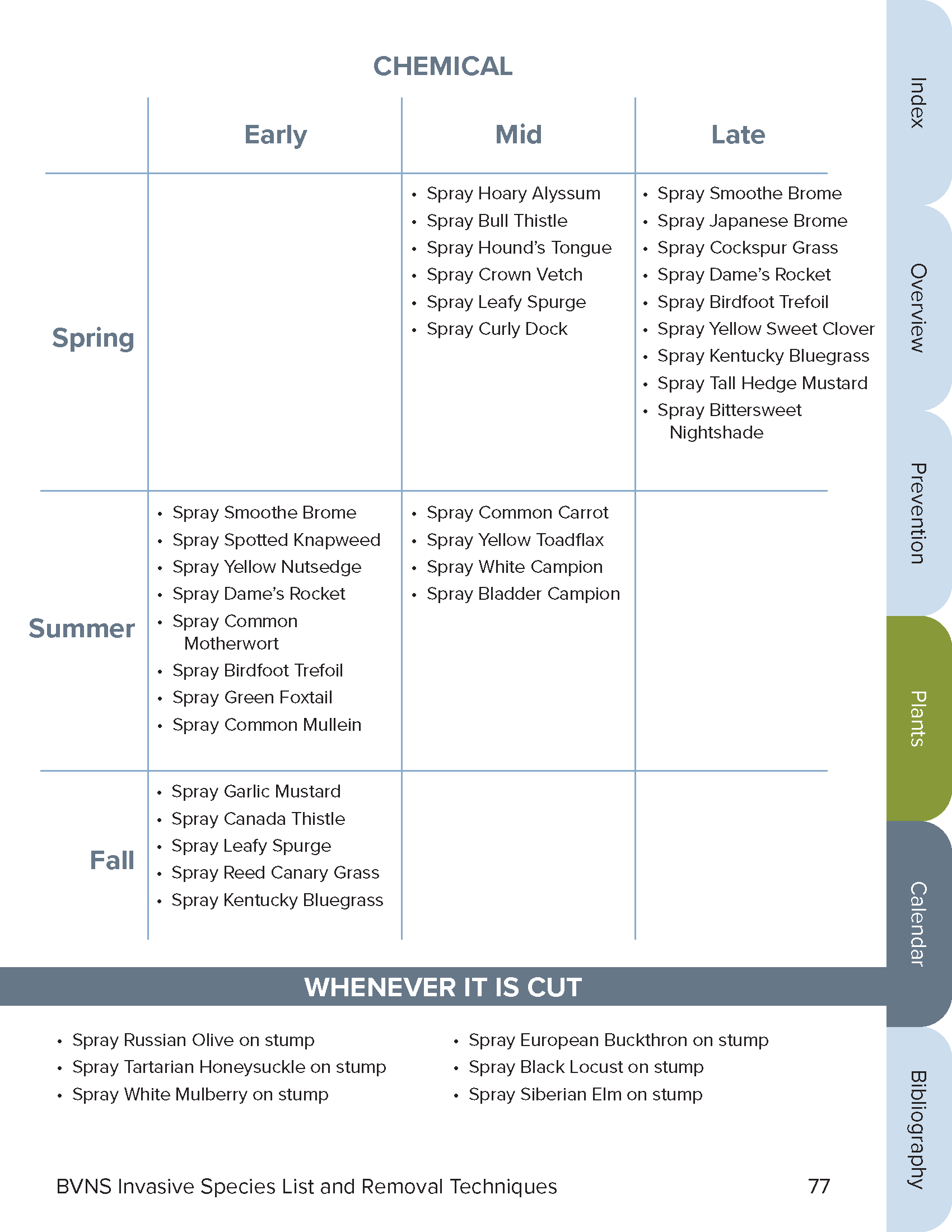
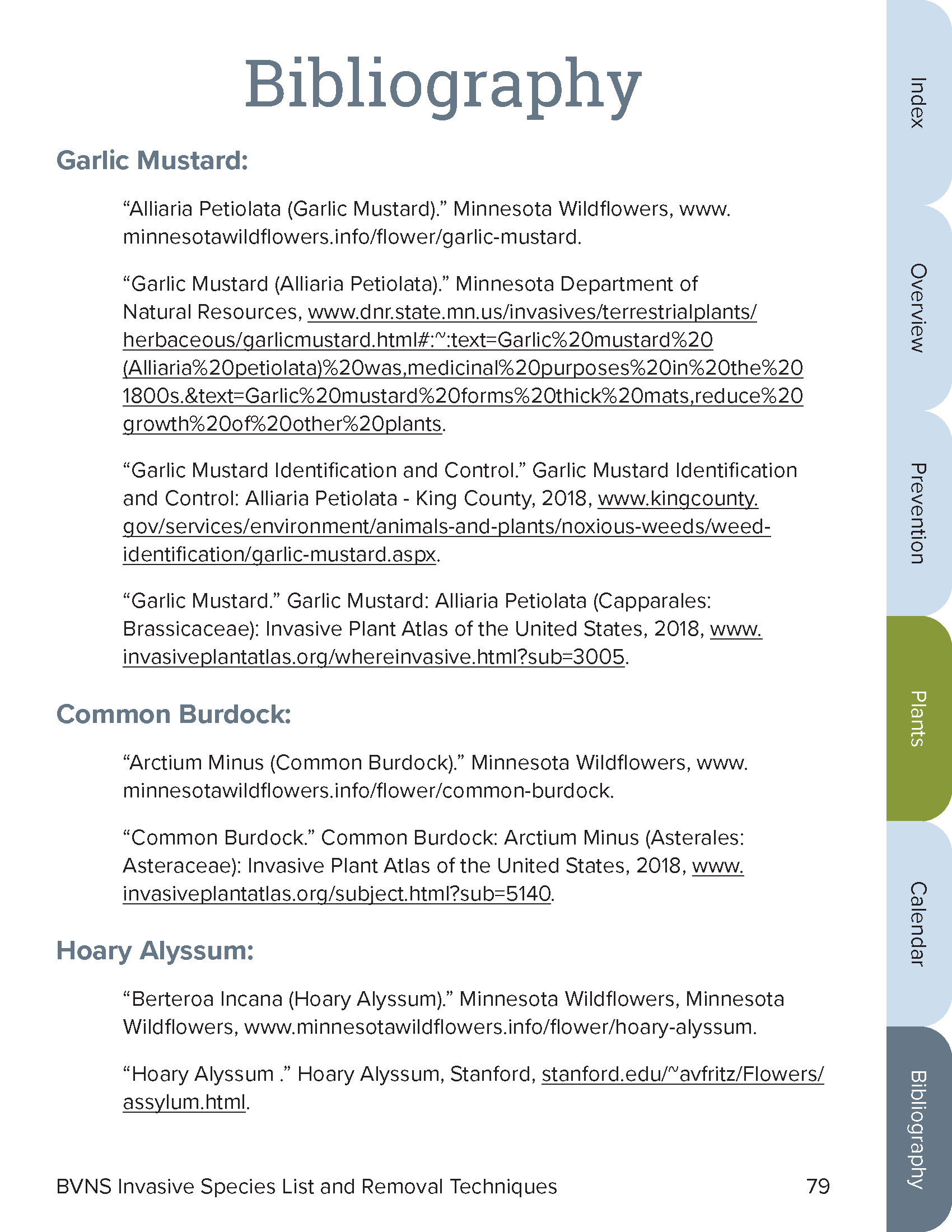
I did not limit my consideration to layout, font, and color, I also considered overall utility and user experience. For example, I added a space on each plant page for a hyperlink to that plant’s entry in the bibliography. This takes advantage of the interactivity possible in a digital document to make the user experience better.
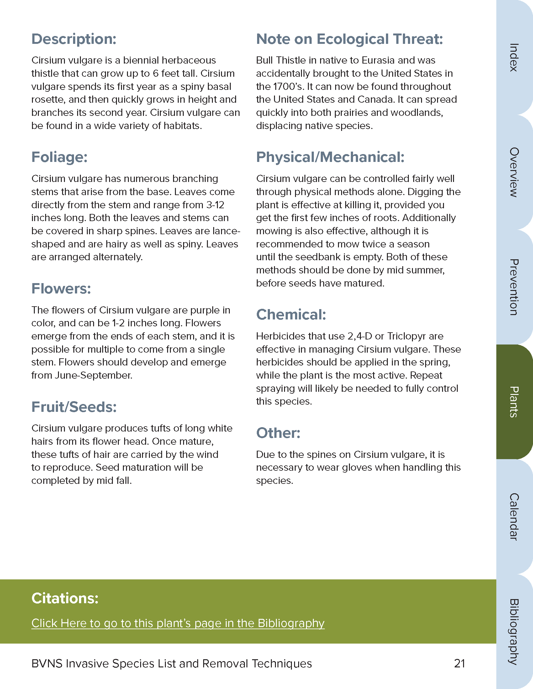

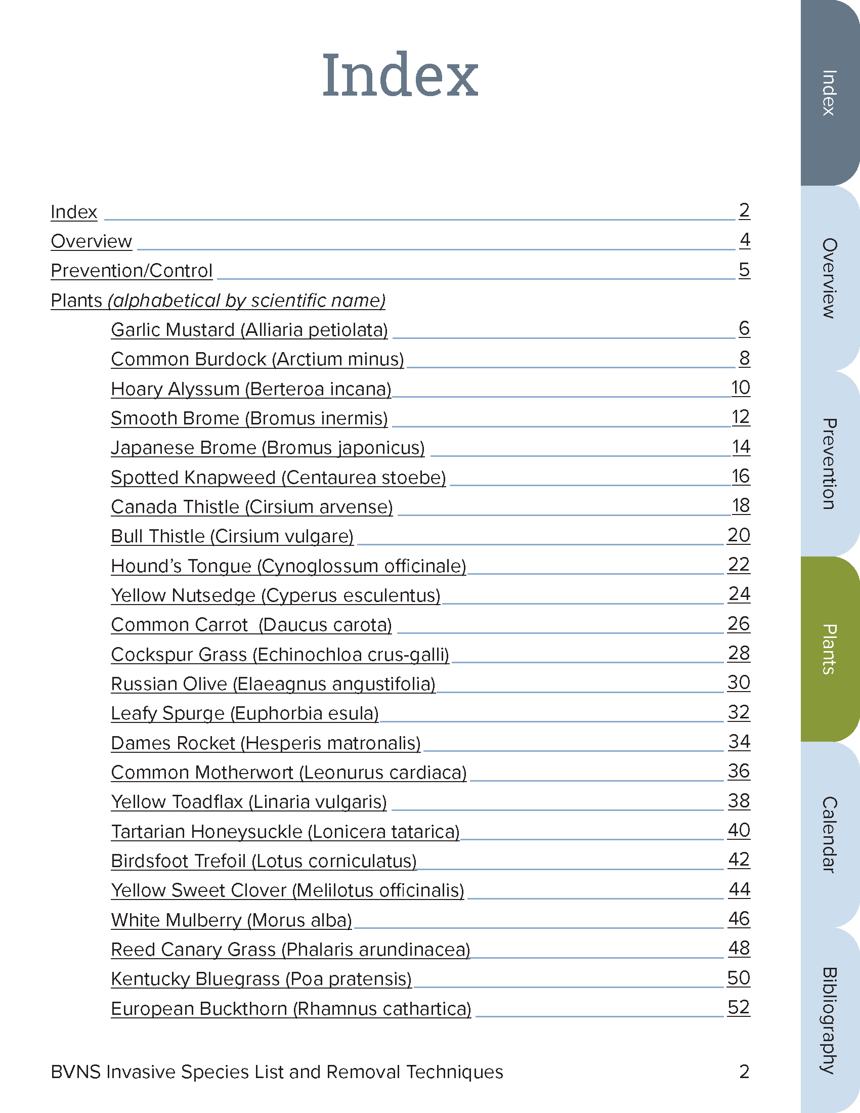
In addition to the index at the start of the document, I created a clickable tab system that would appear on every page besides the cover, to make jumping from section to section as easy as possible. This kind of convenience is expected nowadays with digital content, and the tab design is widely used and recognized.
Furthermore, regarding text hyperlink formatting, I used the common underline style. This is another example of keeping things simple to ensure understanding and ease of use.
Style Tiles
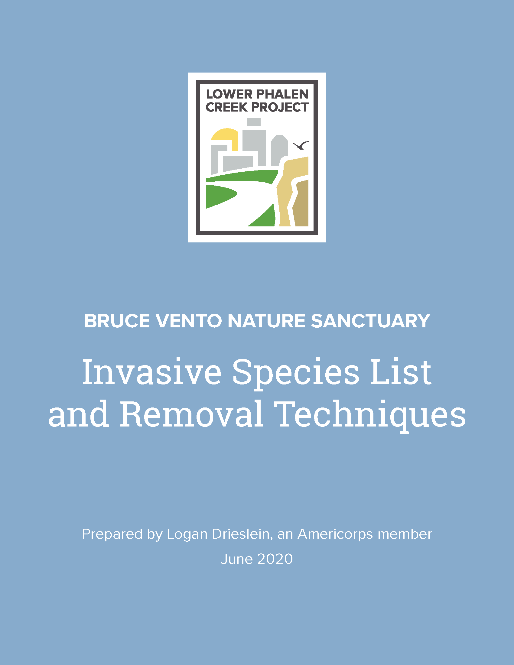
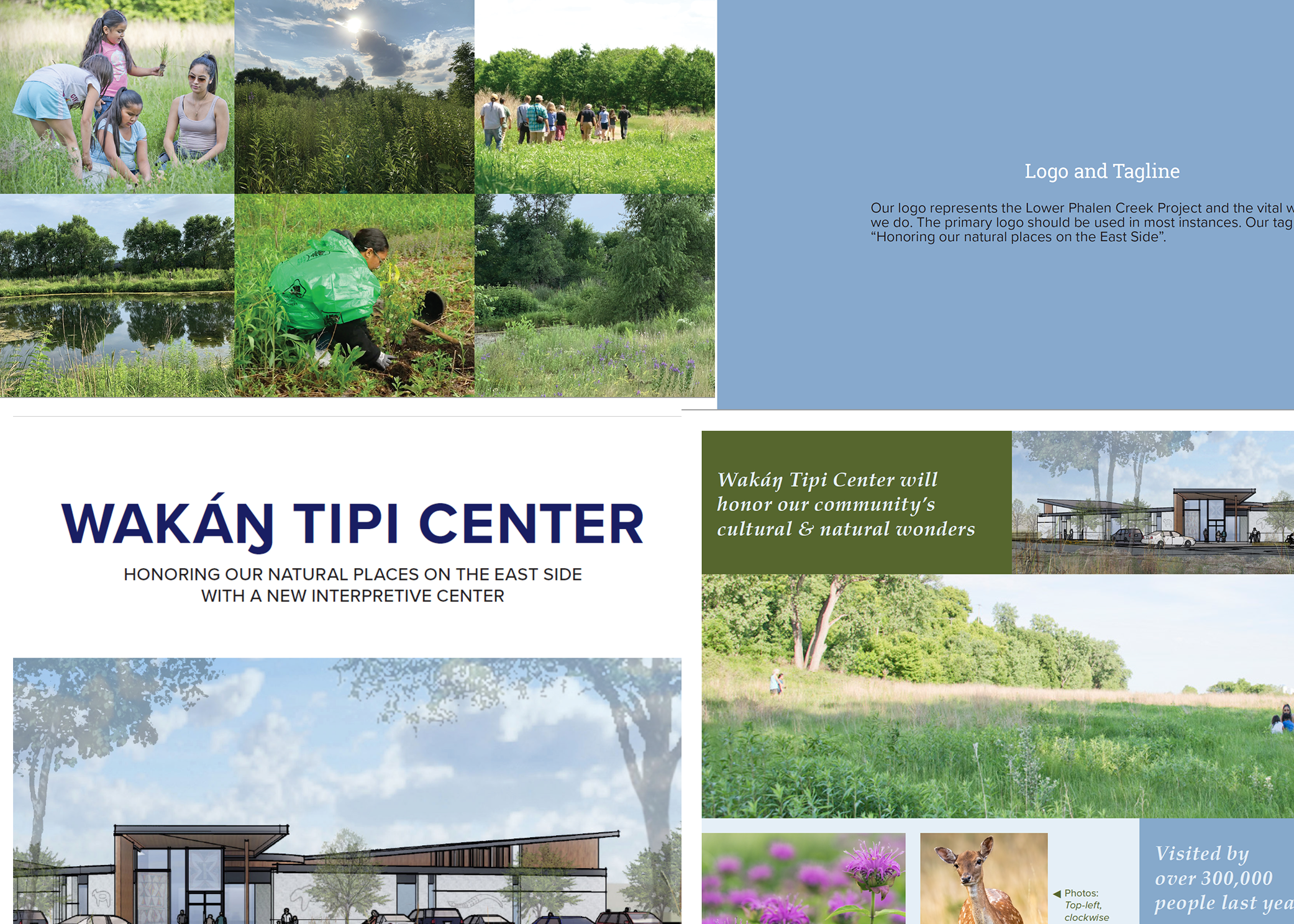
Before starting the final document, I wanted to make sure I had a good handle on color and photo schemes. I experimented with different options in Illustrator. I was able to find a solution using only the colors and fonts given to me in the organization’s style guide.
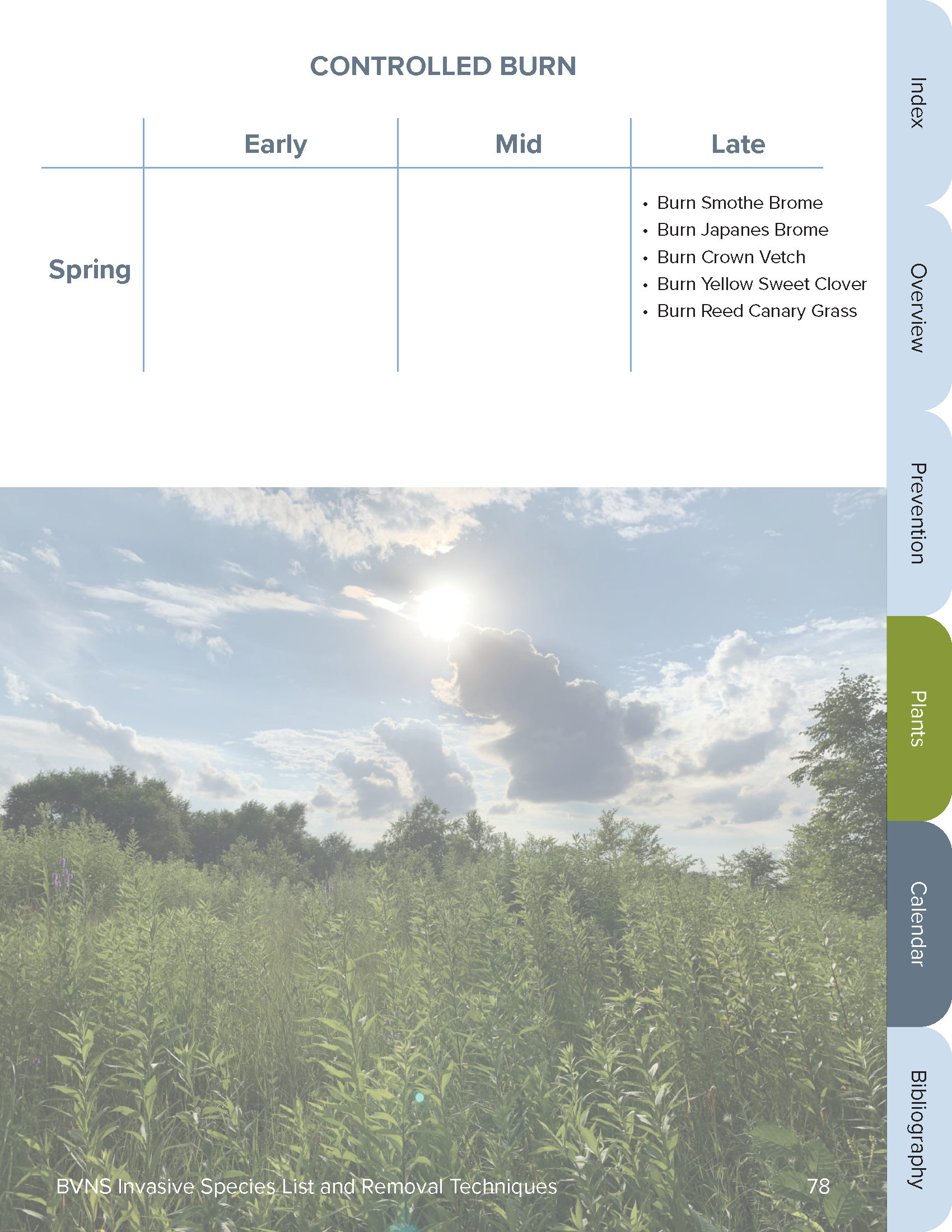
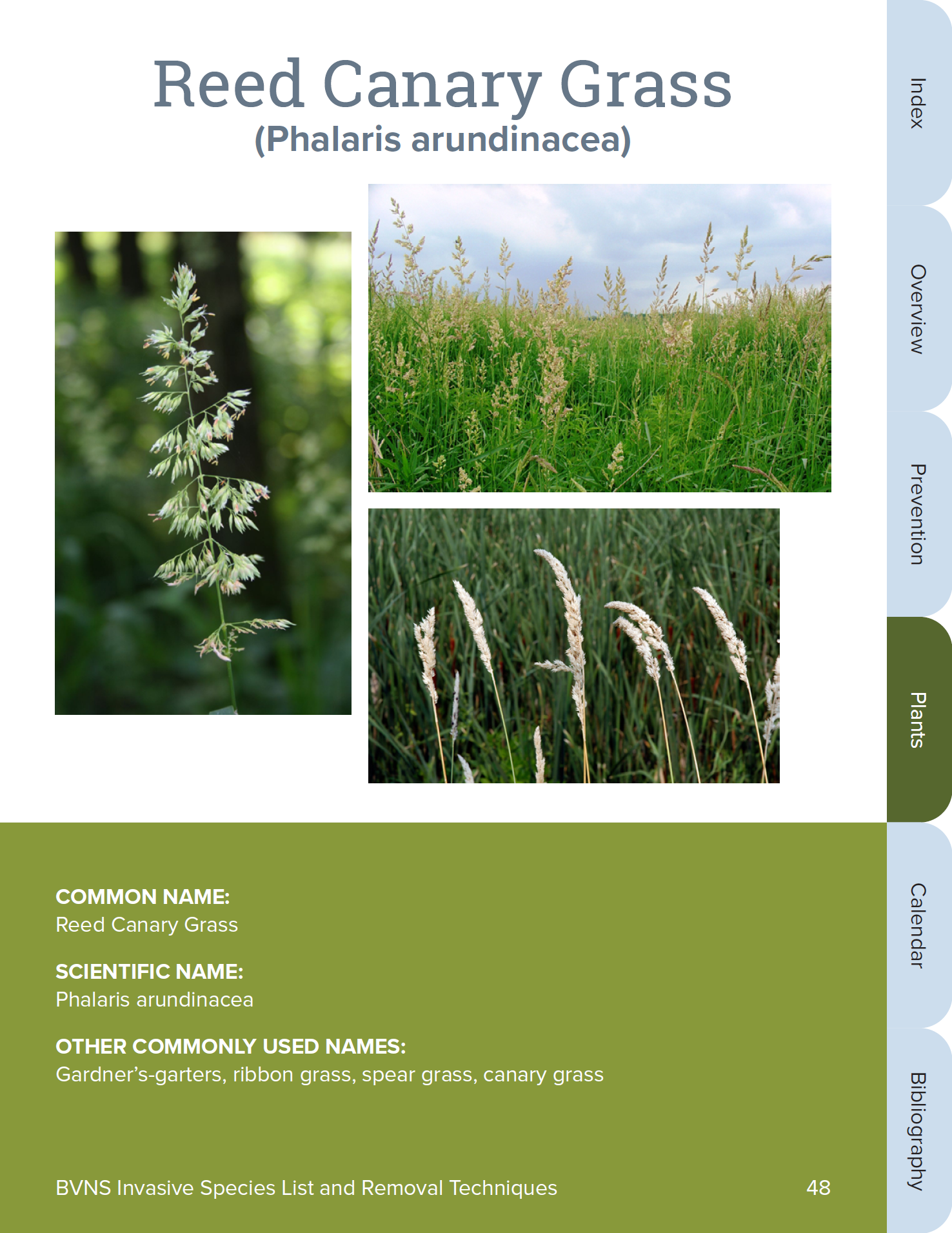
I relied heavily on the way color and photos were used in the organization’s other documents:
- Sans-serif dark text on a white background for body
- Large blocks of color behind white text for variety
- Photos large, square, and plain (no frames, drop shadows, etc.)


Final Deliverables
For the final document I worked in InDesign. I utilized as much automation as possible to save time, including five master pages, automatically detecting URLs, and as few Paragraph and Character styles as I felt were necessary. I exported it as an interactive PDF, as well as a Word document at the client’s request.
The client was pleased with the first version of the final document. They asked if I could be of further help to them with a similar document about native plants, which I will be starting work on soon.
Results
- Value
- Easy to use, polished informational guide
- Multiple formats
- Interactive navigation
- Vector version of logo
- Tools
- Adobe Illustrator
- Adobe Photoshop
- Adobe InDesign
- Pen & Paper
- Adobe Acrobat DC
- Google Docs
- Skills
- Compositon
- Typography
- Work within style guide
- Printing/Publishing
- UI/UX design
- Vector and Raster Image Processing
- Rapport with client
- Total hours
- 26

