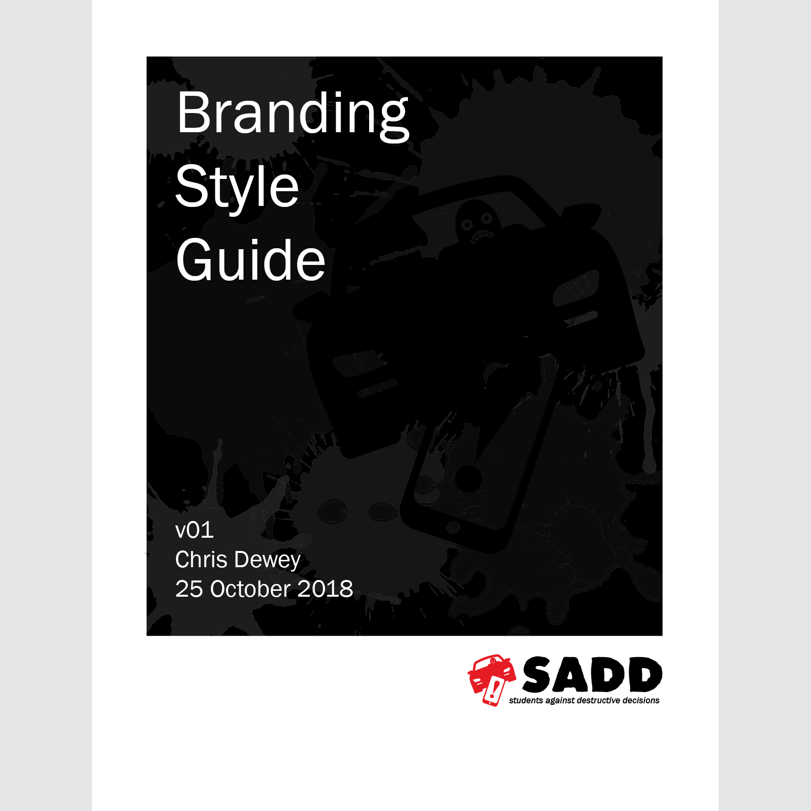
Branding Style Guide
I've learned in my college and professional career how important style guides are to effective visual branding. I put a lot of thought into this prospective design for Students Against Destructive Decisions, a non-profit safety organization.
The first challege was the wide rage of topics SADD is involved with, from underage drinking to video game and gambling addictions. I chose to focus on the issue of distracted driving, but kept the overall design simple enough that it could be generalized to other branches as well.
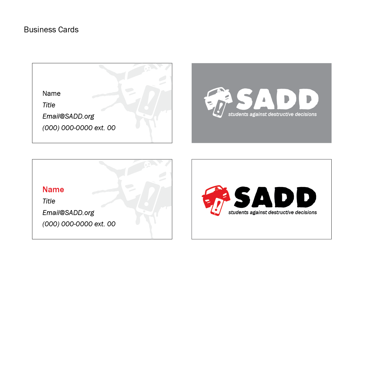
I picked the color scheme of red, black and white for its elasticity and serious tone. The logo and logotype I designed to be eye-catching for the intented audience of teens and young adults. Finally, I kept to the design philosophy of "less is more," with plenty of white space and justified visual elements for ease and simplicity.