Event Poster: Multiple Solutions
As a graphic design assignment, I was tasked with creating multiple 12" x 18" poster designs for a public event. Of the three designs, one had to only use typography, a second had to use graphics and no photos, and the third combined photos, graphic elements and typography. For the event I chose the annual Women's March that happens in January, specifically the version that takes place in Walnut Creek.
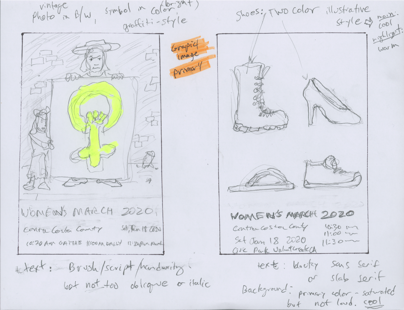
In my research, I found that political posters tended to be either "punk" or formal in tone, and that they strive to communicate inclusiveness of diversity, as well as unity of message.
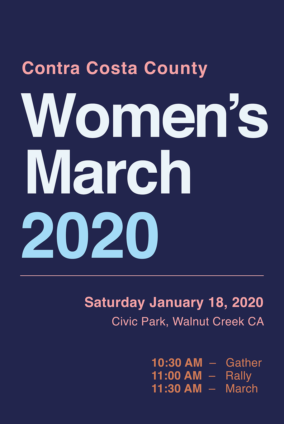
For the type-only solution, I happen to have a t-shirt that features white, bold Helvetica text on a black background. It seems like whenever I wear it at least one person notices it and approaches me about it, so I thought that would be a good starting point. I used low saturation versions of red, white, and blue (a pretty common technique for liberal political campaigns, I've noticed) plus a dull orange to represent California.
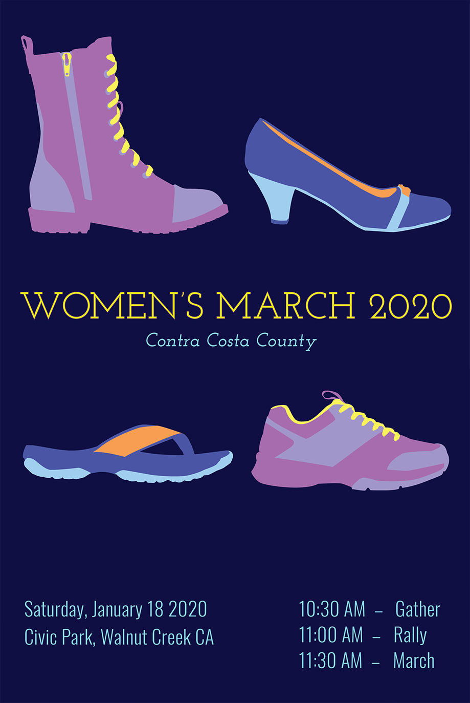
For the Graphic Solution I decided that shoes could not only represent diversity/unity, but relate to the subject matter: a march. I traced various shoe styles in Illustrator and went with a thin slab-serif typeface for the titles, because it seemed approachable as well as serious.
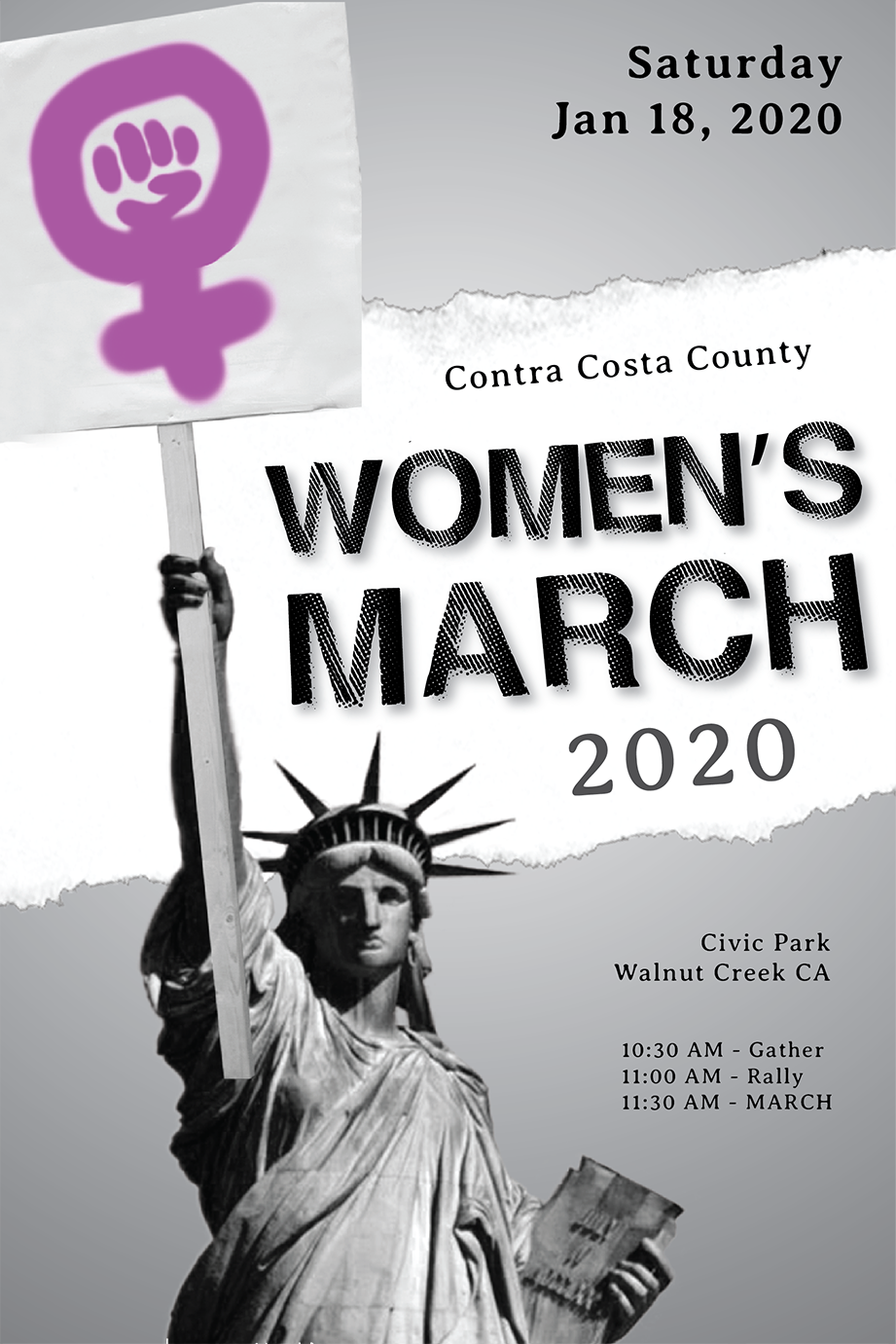
The Photographic Solution I decided would be a good opportunity to include the Statue of Liberty, as she is both a woman and closely tied to patriotism. For this design I went with a more "punk" aesthetic, with torn paper, a "hand painted" female power symbol, and looser typography.