Voice Over Visual Branding
Challenge
In March 2020, a voice actor named Tucker Fortson reached out to me, having heard about me through networking. He was interested in a logo design for his website. I was excited for the opportunity. Tucker described his brand as “authentically cool, dynamically real,” and was looking for a design that was professional and clean as well as giving a sense of the vitality and friendliness of his personal style.
We agreed on an estimate and timetable and I got to work!
Process
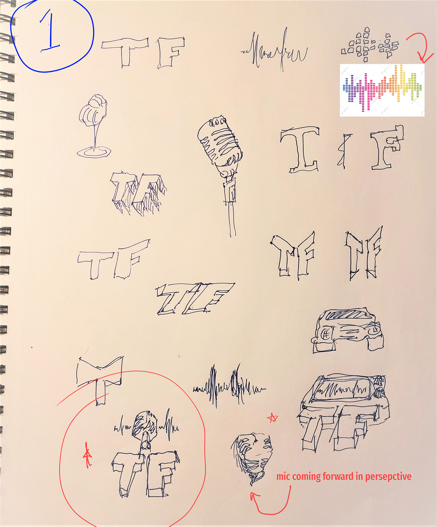
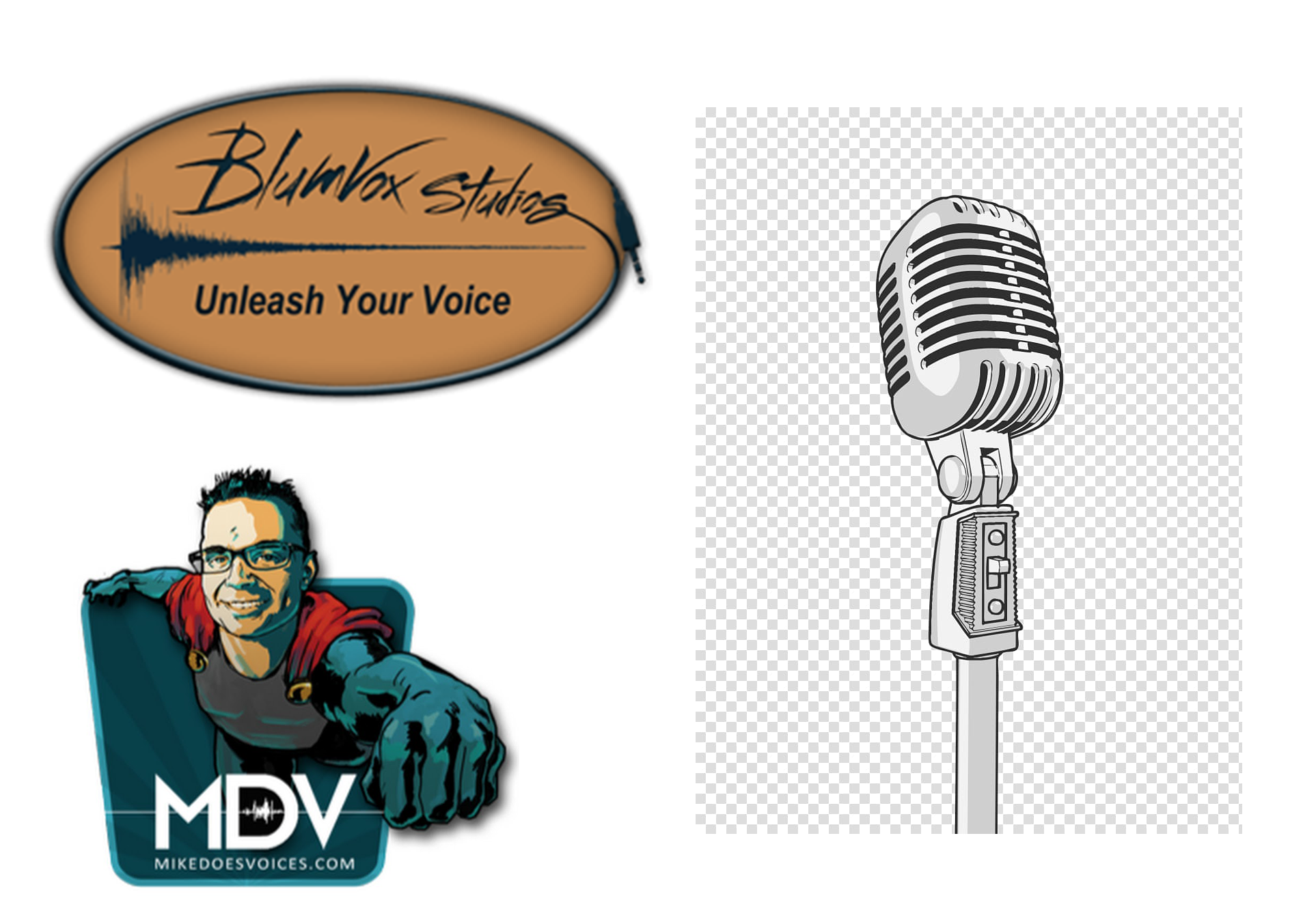
For research, Tucker provided me with some examples of voice over logos that inspired him, as well as the basic idea he was going for: the initals “TF” and a sound wave design or vintage microphone. I listened to samples of his voice over work. I did further research on common motifs for voice over logos, to make sure that the design I came up with stood out among the others.
Sketches
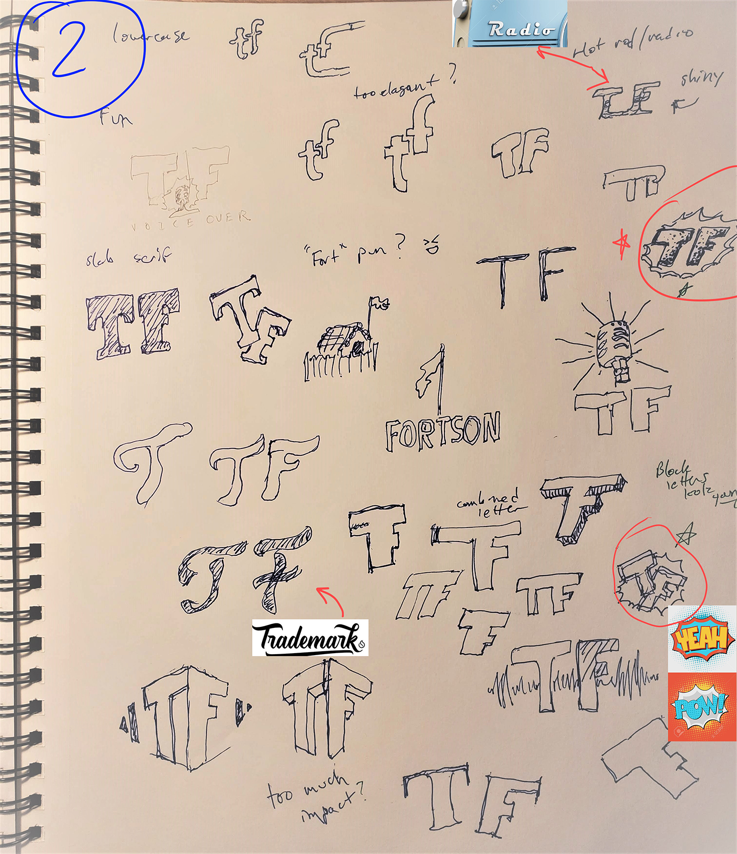
The first round of sketches was all about brainstorming. I tried to get every possible idea I had down on paper to get an idea of how it might work. I used the images provided to me by the client, my own research on typography and imagery, as well as taking into account other hobby interests the client had that would direct me on his unique style.
Typography
Roughs
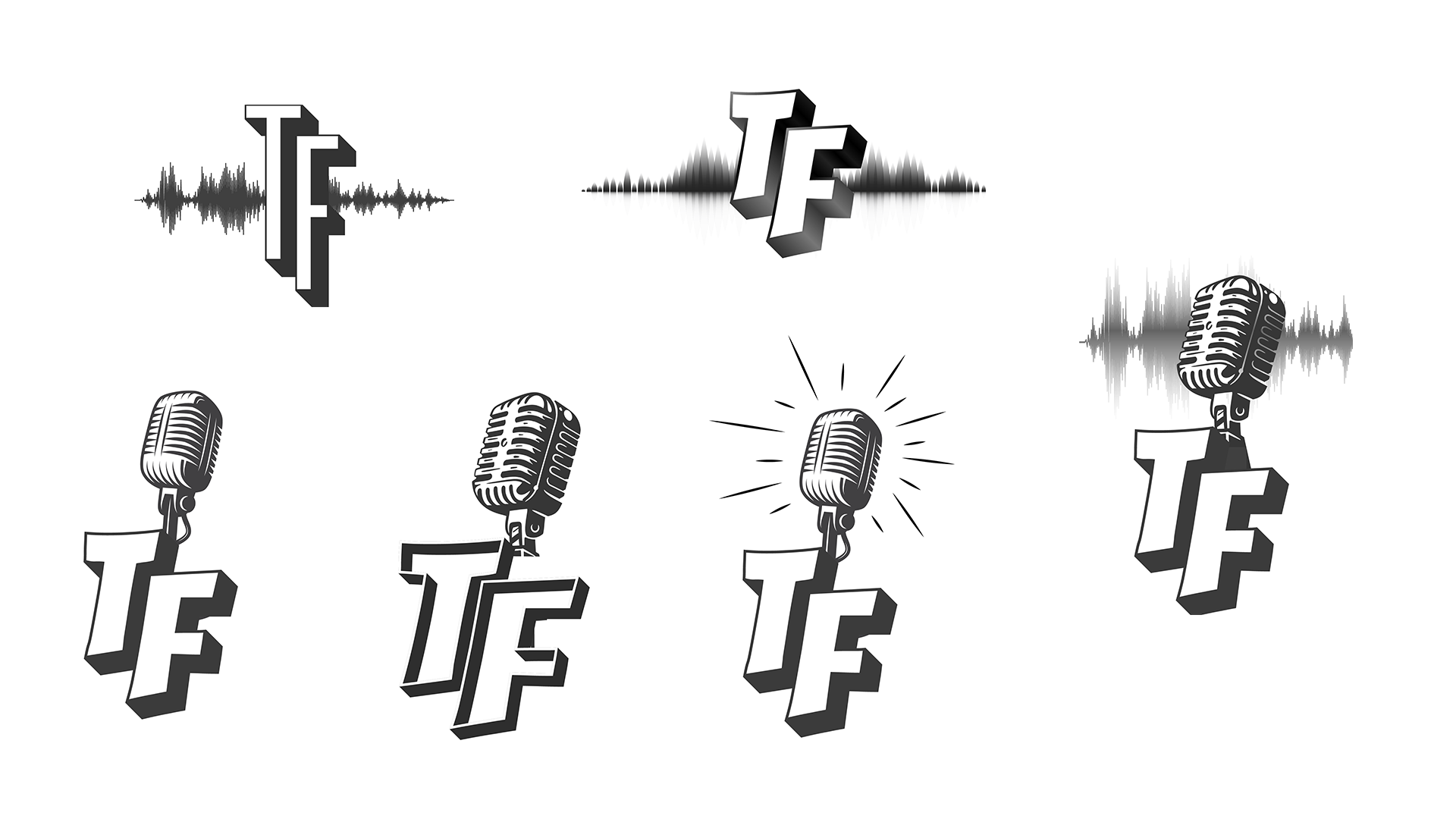
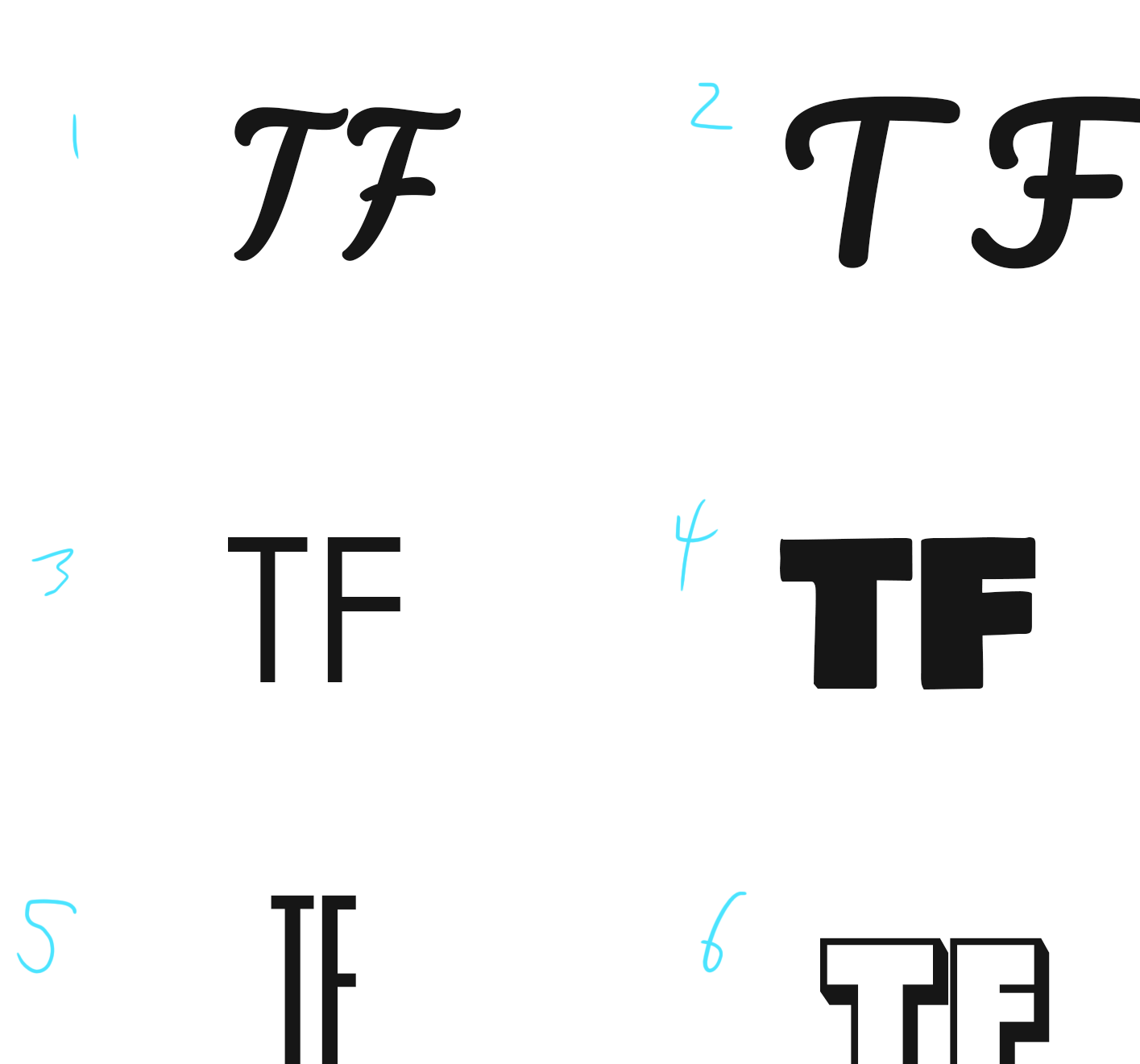
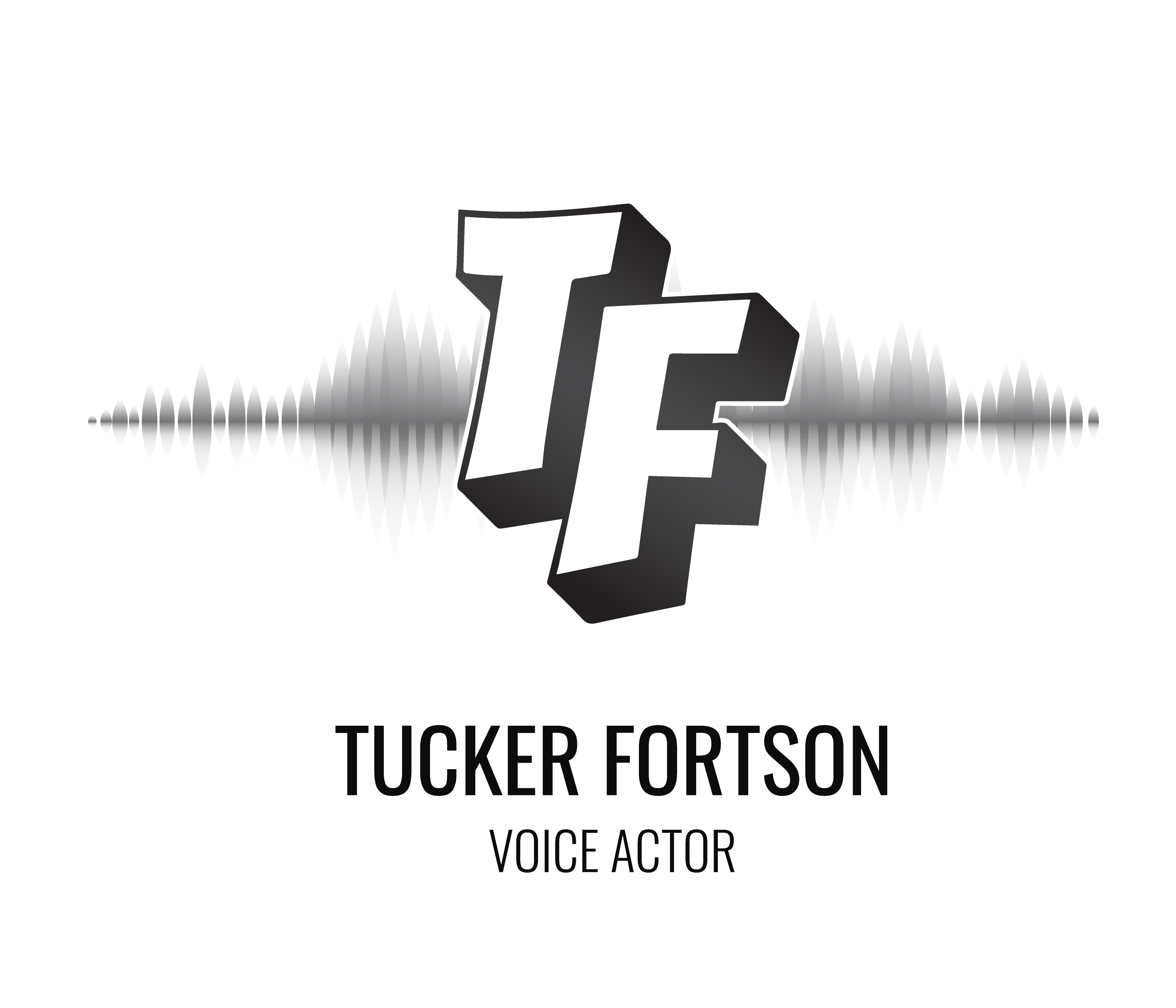
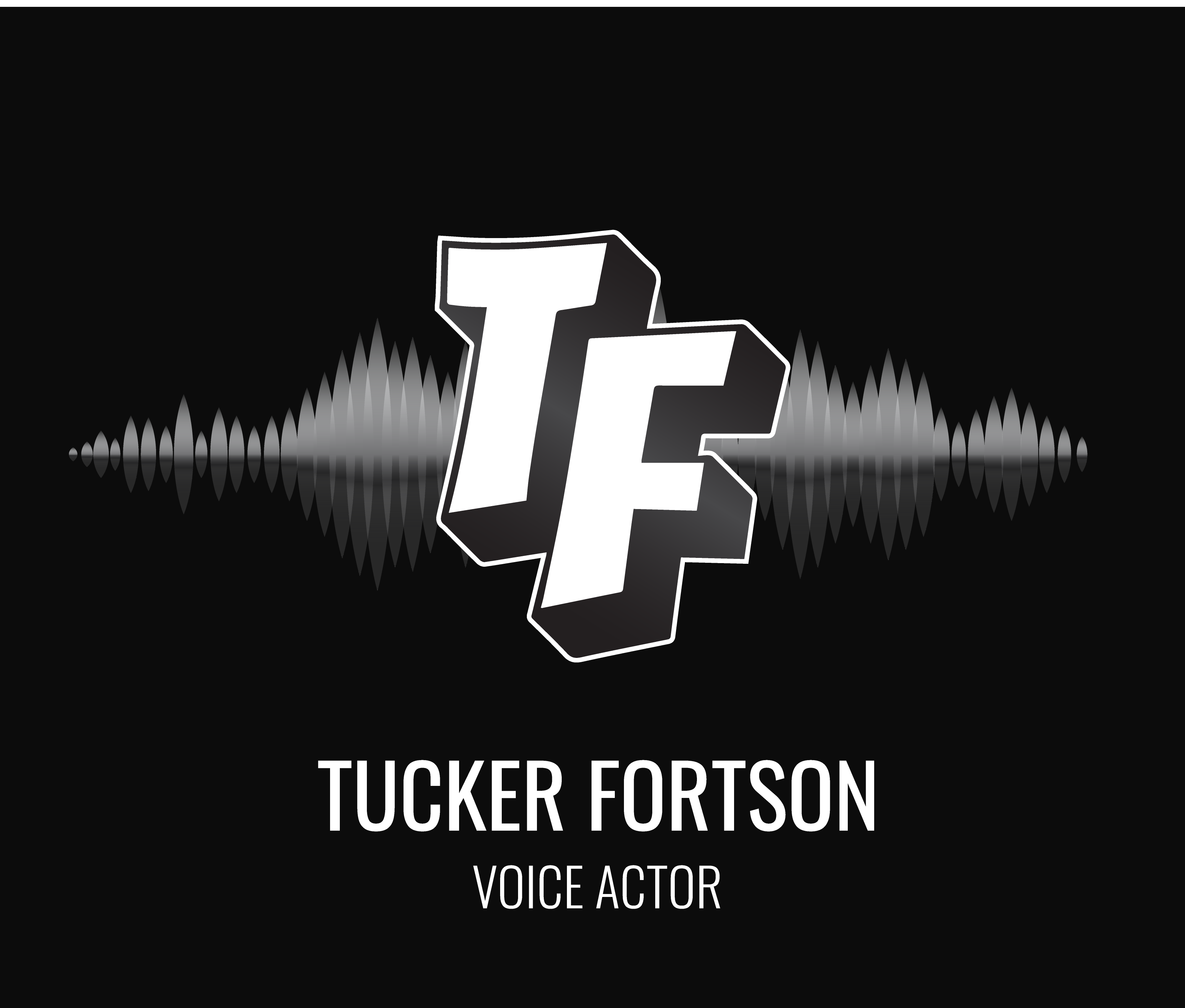
The next problem was integrating the sound wave or the vintage mic. I tried a variety of visual styles and compositions. The client and their manager agreed on a design featuring the sound wave, and we left the vintage mic behind.
Color
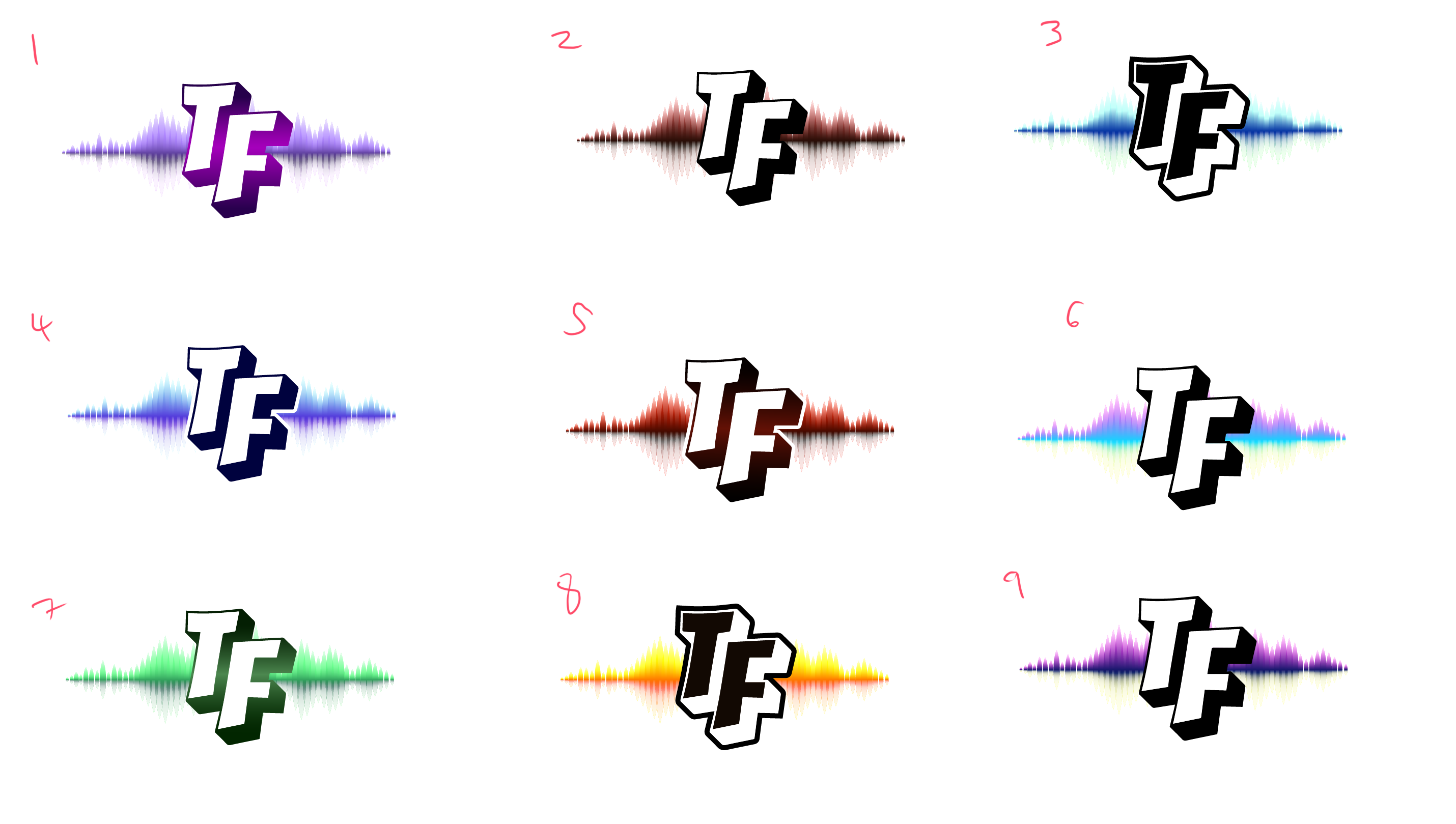
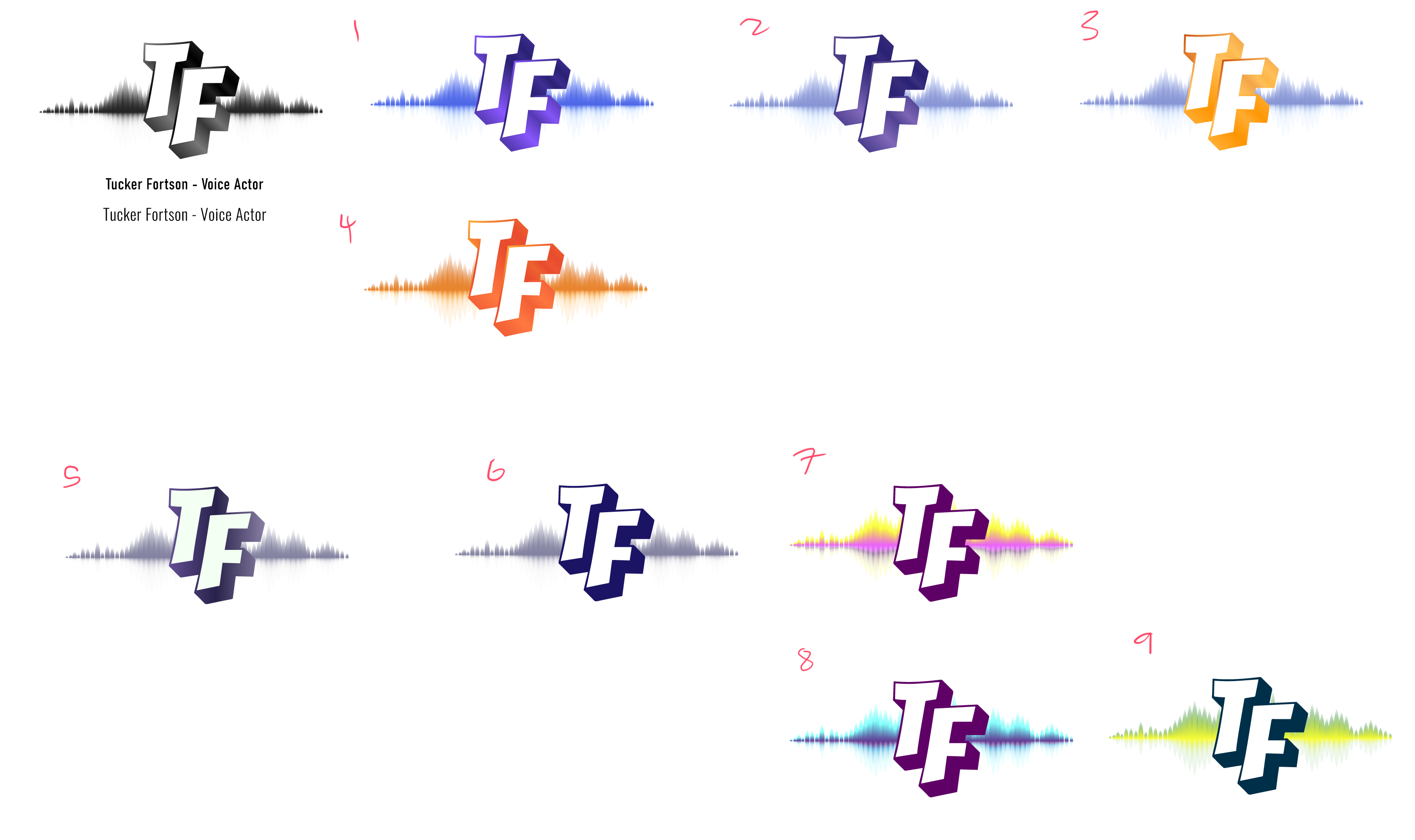
The biggest lesson I learned on this project was not to underestimate how much work adding color to a black and white logo can be. Color introduced so many variables, and the different values of specific hues made it challenging to recreate the value balance I had in the black and white version.
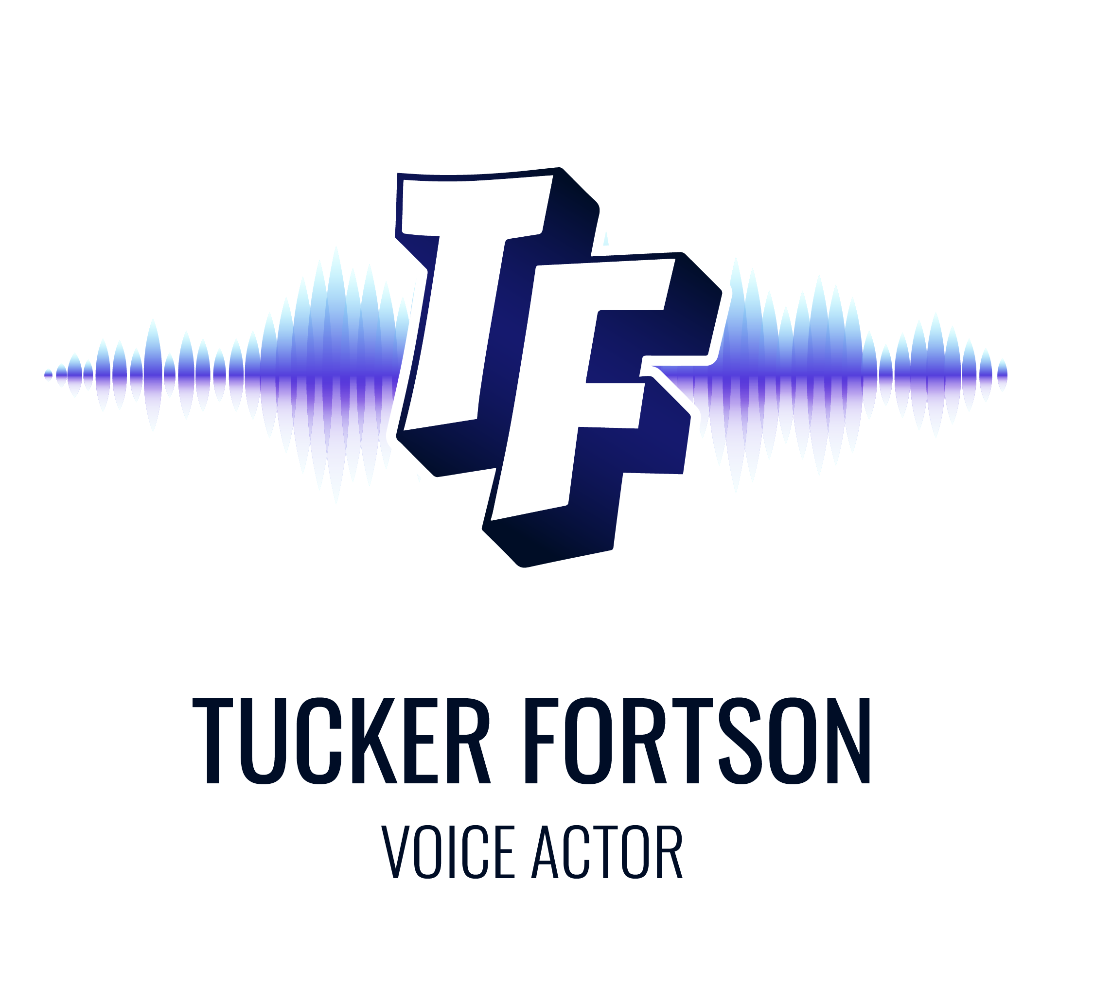
I was still able to turn in color comps on time. I think I provided a few too many color choices to the client, as he said it was a bit overwhelming. We settled on a cool color scheme with purple and blue gradients.
Final Deliverables
Results
- Value
- Dynamic visual branding to use on digital and print
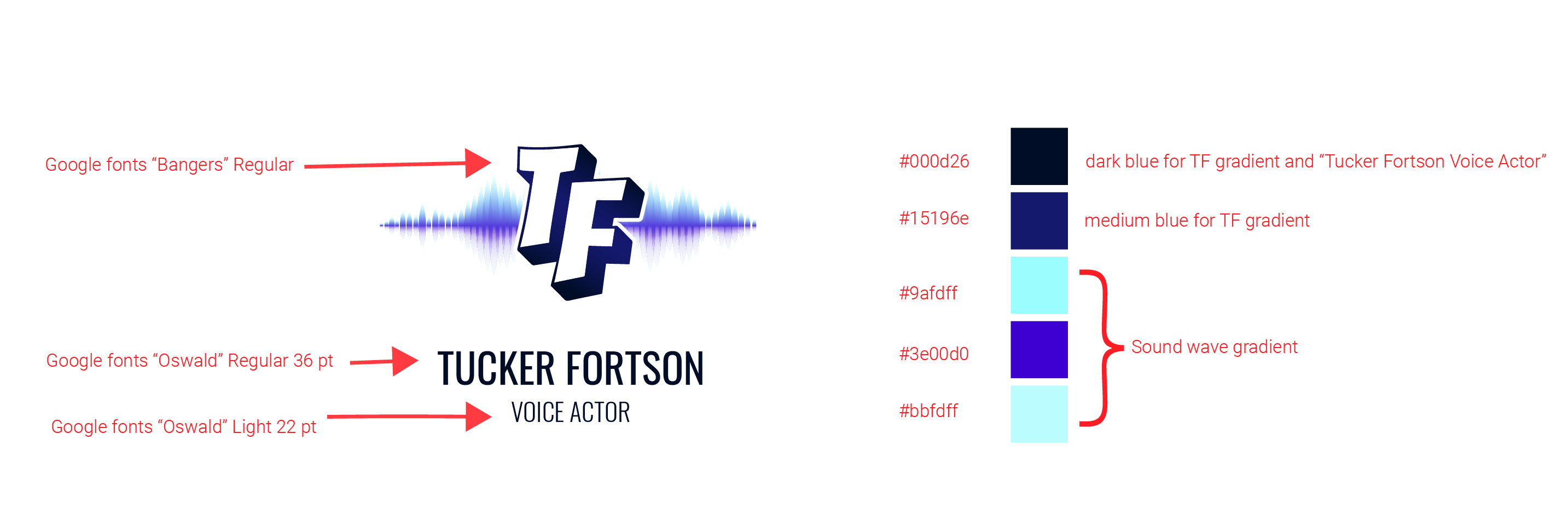
- Style guide including type and color to inform website and print materials
- Clean, professional design that communicates brand message
- Tucker Fortson Voice Over Website
- Tools
- Adobe Illustrator
- Adobe Photoshop
- Adobe Stock
- Pen & Paper
- Microsoft Surface Tablet
- Skills
- Branding Design
- Marketing
- Typography
- Color Theory
- Vector and Raster Image Processing
- Total hours
- 11.5

